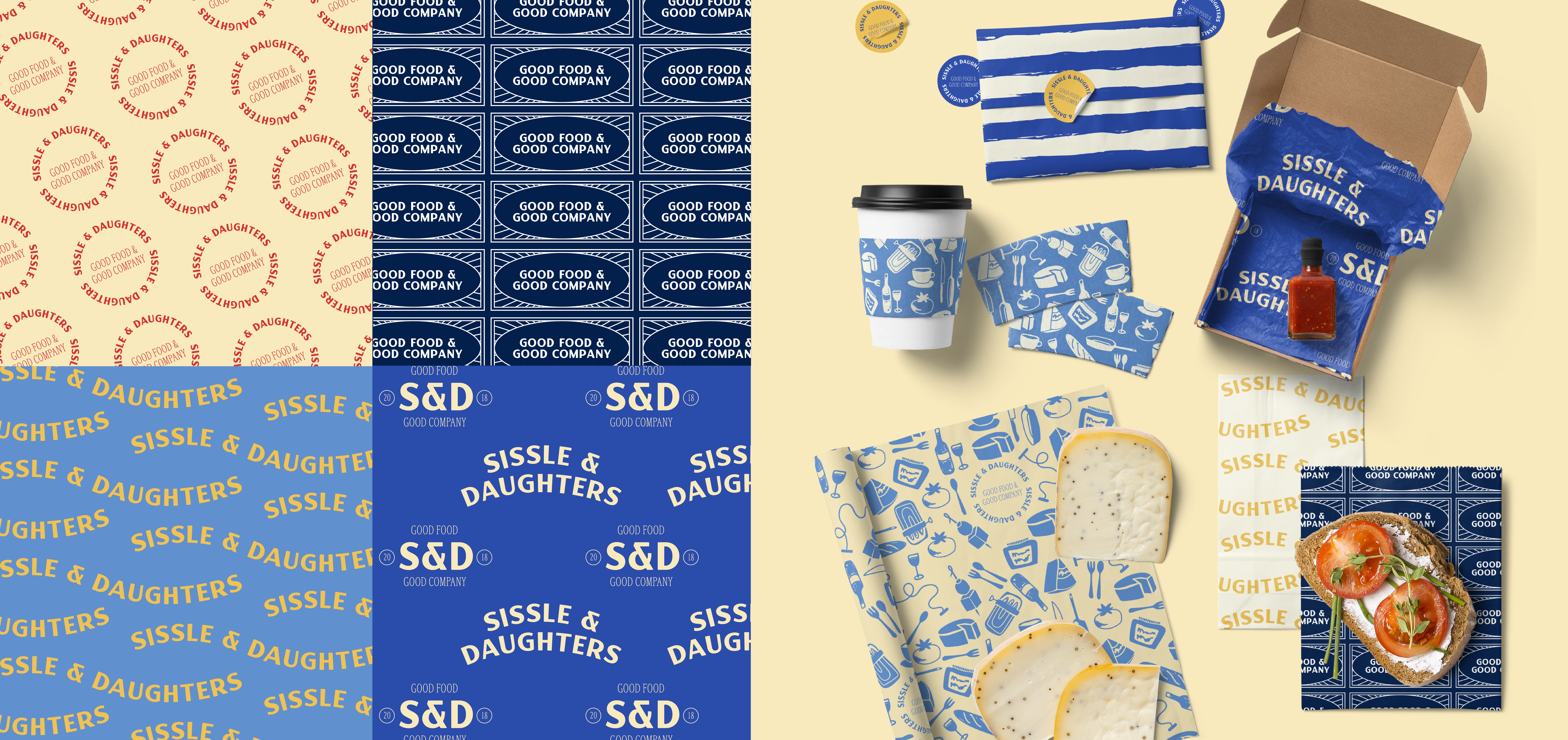
Sissle & Daughters Cheesemongers & Grocers has been a fixture of Portland's food community since 2018, when owners Mary Chapman and Will Sissle opened The Cheese Shop of Portland.
After the birth of their two daughters, Hattie and Tess, and with a second location on the horizon, they wanted a brand that captured who they had become—seasoned tastemakers with the warmth and unpretentiousness that sets them apart from the typical specialty food experience.

First Pier led the team through a full brand identity project: a collaborative work session to surface core attributes and define their voice, followed by positioning and tagline development. The process landed on Good Food & Good Company—a line that captured their product quality, hospitality, and community all at once—and that foundation informed every design decision that followed.
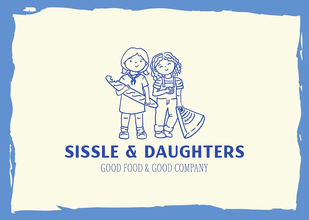
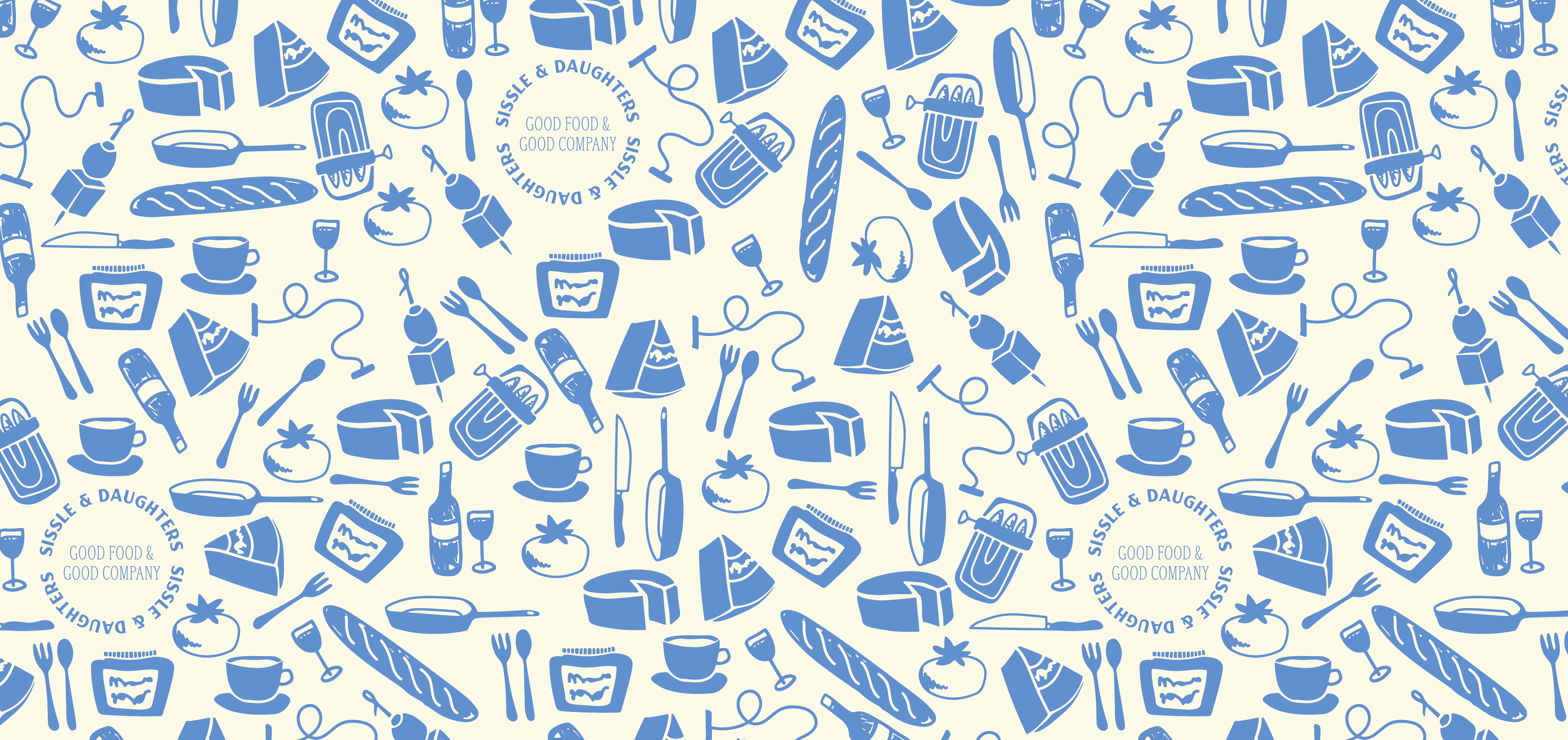
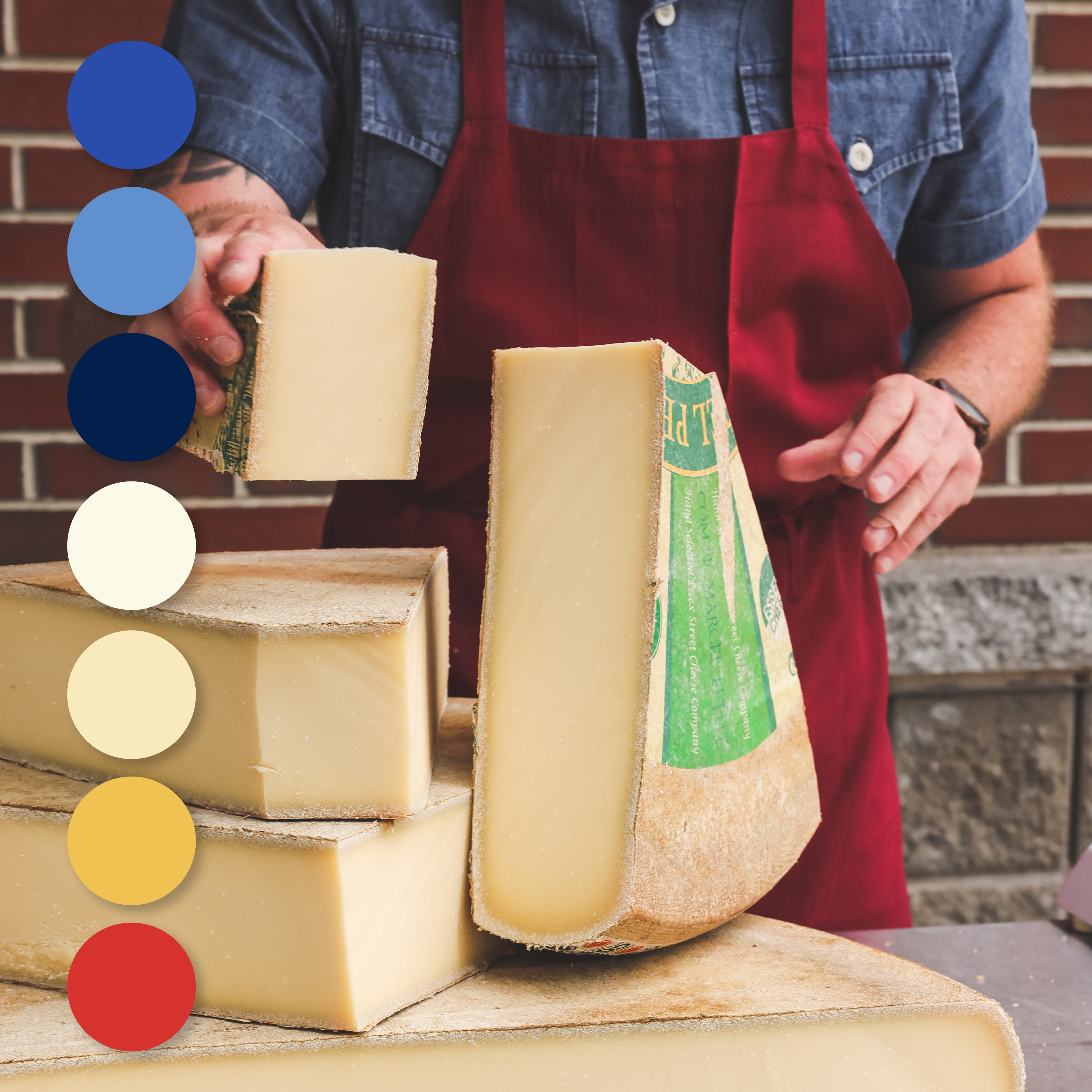
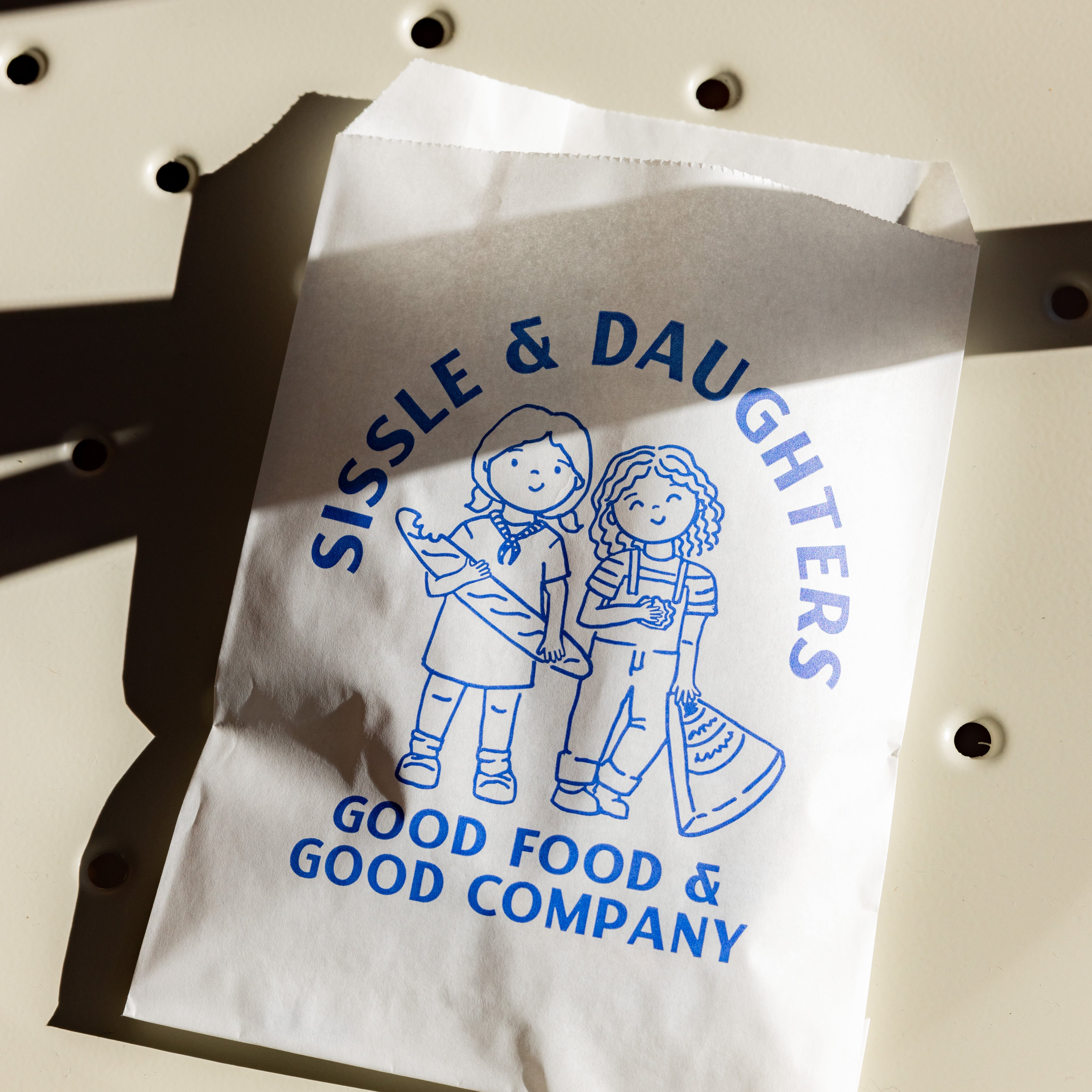
The resulting visual identity is playful and timeless in equal measure. The primary logo features a hand-drawn illustration of Hattie and Tess alongside a modern wordmark. A bold palette of blues and warm yellows evokes French bistro sophistication without any stuffiness, complemented by custom iconography, a signature doodle pattern, and a rustic French stripe—a flexible system that shows up consistently across packaging, signage, and in-store collateral.


We really appreciated the holistic approach to the rebrand. First Pier's process really allowed us to think deeply and creatively about who we are, and what we aspire to be as a company.
Anonymous Executive — Sissle & Daughters

The hardest thing to put into a visual system is a welcome.
A specialty cheese shop competes on expertise, and expertise renders very easily as intimidation. Mary Chapman and Will Sissle had spent years building the opposite — a shop where you can ask an obvious question without embarrassment — and a rebrand leaning on connoisseurship would have described a business they had deliberately not built.
The positioning work landed on Good Food & Good Company, which does the whole job in four words: the product is serious, the room is not. Every design decision after that had a test to pass.
That is why the logo is a hand-drawn illustration of Hattie and Tess rather than a mark about cheese, and why the palette pairs bistro blues with warm yellows instead of the muted craft-food register everyone else is using. The doodle pattern and the rustic French stripe give the system enough range to carry across packaging, signage and in-store collateral without turning formal.
Naming what a business is not is usually more useful than naming what it is. Sissle & Daughters is not a temple to cheese, and the identity had to be unmistakable about that.
We thought you might say that! We've been dying to meet you too.