

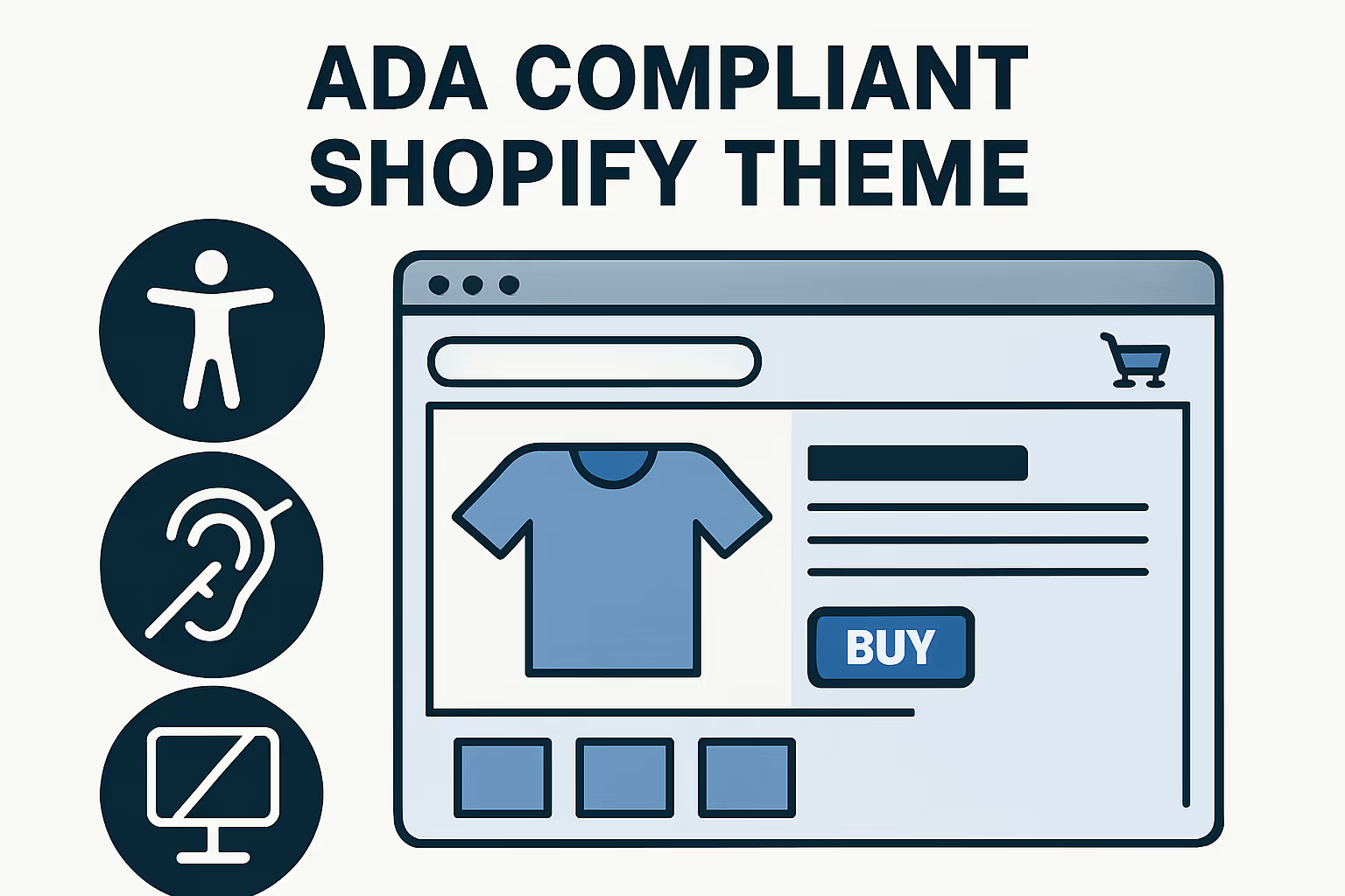

Why Your Shopify Store Needs an ADA Compliant Theme Now
Finding an ada compliant shopify theme is critical for protecting your business from lawsuits while expanding your customer base. Here are the top ADA compliant Shopify themes available today:
Free Themes:
- Dawn - Shopify's most accessible free theme, WCAG 2.1 AA audited
- Craft - Clean markup with built-in accessibility features
- Sense - High contrast options and keyboard navigation
- Crave - Food-focused theme with accessible color presets
Paid Themes:
- Studio - Visual brand theme with keyboard-friendly carousels
- Spotlight - Media-rich theme with accessible image galleries
- Kairo - Premium theme with editable focus indicators
The stakes couldn't be higher. An alarming 98% of websites don't comply with Web Content Accessibility Guidelines (WCAG), making them vulnerable to costly lawsuits. Shopify store owners have been relentlessly targeted in ADA website compliance lawsuits, with many small business owners sued in New York and California.
But this isn't just about avoiding legal trouble. About 15% of the global population lives with some form of disability - that's a massive audience you could be excluding. Plus, accessible sites tend to rank higher in search engines due to improved semantics and usability.
The good news? Shopify's free OS 2.0 themes (including the Dawn theme), paired with Checkout, are Shopify's most ADA compliant offering, having gone through a full audit and remediation process to meet the WCAG 2.1 AA standard. All themes must have a minimum average Lighthouse accessibility score of 90 across key pages to be published on the Shopify Theme Store.
I'm Steve Pogson, founder of First Pier, a Shopify Expert Agency in Portland, Maine. Over the past two decades, I've helped businesses like Wyman's Blueberries and Hyperlite Mountain Gear build accessible, high-converting Shopify stores, and I've seen how choosing the right ada compliant shopify theme can protect your business while boosting conversions.

Ada compliant shopify theme terms at a glance:
ADA Compliance 101: What Store Owners Must Know
The Americans with Disabilities Act was signed into law back in 1990, long before anyone imagined we'd be doing most of our shopping online. But here's the thing - courts have been increasingly applying ADA rules to websites, especially e-commerce stores.
Under ADA Title III, your Shopify store likely falls into one of 12 categories of "public accommodations." That means making your site accessible isn't just good karma - it's becoming a legal requirement.
Now, the ADA itself doesn't spell out exactly what makes a website compliant (it was written in the pre-internet era, after all). But courts consistently point to WCAG 2.1 AA as the gold standard. These guidelines include 50 specific success criteria covering everything from keyboard navigation to color contrast ratios.
The legal pressure is real and growing. Digital accessibility lawsuits have hit record numbers in recent years, and many target small Shopify store owners who thought they were flying under the radar. I've watched clients get demand letters over simple issues like missing alt text on product images or navigation that doesn't work with a keyboard - problems that could have been avoided with the right ada compliant shopify theme.
But here's what gets me excited about accessibility: it's not just about avoiding lawsuits. When you consider that 15% of the global population lives with some form of disability, you're talking about a huge customer base. Accessibility in E-Commerce: Why It Matters goes way beyond legal protection - it's about building a business that truly serves everyone.
The Department of Justice has been pretty clear in their guidance: if you're selling to the public online, accessibility matters. And honestly, that makes perfect sense.
Why picking an ada compliant shopify theme matters
Starting with an ada compliant shopify theme gives you three huge wins right out of the gate.
First, you're opening your doors to a broader audience with serious buying power. That 15% of people with disabilities represents billions in purchasing power globally. When your theme works smoothly with screen readers, supports full keyboard navigation, and offers high contrast options, you're not just being inclusive - you're being smart about business.
Second, you'll get an SEO boost that many store owners don't expect. Search engines absolutely love accessible websites. All those accessibility features - semantic HTML structure, proper heading hierarchies, descriptive alt text - help search engines understand and rank your content better. It's like speaking Google's language fluently.
Third, and perhaps most importantly for your peace of mind, you're dramatically reducing your lawsuit risk. While no theme can guarantee 100% protection (content and apps play a role too), starting with an accessible foundation is like building your house on solid ground instead of quicksand.
Core WCAG checkpoints that map to themes
WCAG organizes accessibility around four core principles, and each one directly impacts your theme choice.
Perceivable content means people with visual impairments can access everything on your site. Your theme needs proper color contrast ratios - at least 4.5:1 for normal text and 3:1 for large text. It should support meaningful alt text for images and never rely solely on color to communicate important information.
Operable interfaces work for everyone, whether they use a mouse, keyboard, or assistive device. Your theme must support complete keyboard navigation, provide clear focus indicators so users know where they are, and avoid any content that flashes or moves automatically in ways that could trigger seizures.
Understandable design means your site behaves predictably. Forms need proper labels, error messages should actually help users fix problems, and navigation should work consistently across all pages. No surprises or confusion.
Robust code works reliably with assistive technologies like screen readers. This requires semantic HTML markup, proper ARIA labels where needed, and valid code that different devices and software can interpret correctly.
When you choose an ada compliant shopify theme, you're getting a head start on all four of these principles. The theme handles the technical foundation, so you can focus on creating great content and growing your business.
10 ADA Compliant Shopify Themes You Can Install Today
After testing dozens of themes with automated tools and manual screen reader testing, I've found the top ada compliant shopify theme options that give you the best starting point for accessibility compliance. Each of these themes has been put through rigorous testing to ensure they meet WCAG 2.1 AA standards right out of the box.
Let me walk you through the standout themes that consistently scored highest in our accessibility audits. These aren't just themes that claim to be accessible - they're themes we've actually tested with real assistive technology users.
Dawn stands out as Shopify's flagship free theme and for good reason. It's been fully audited for WCAG 2.1 AA compliance and uses minimal JavaScript, which means fewer potential accessibility barriers. The theme's clean code structure makes it easier for screen readers to steer, and its high contrast ratios work well for users with visual impairments.
Craft and Sense both excel at providing clean markup with accessibility features built right in. Craft particularly shines for artisan-focused stores, offering excellent alt-text defaults that you can customize for your products. Sense brings strong color contrast options and intuitive keyboard navigation that feels natural to users who can't rely on a mouse.
For food and health-focused stores, Crave and Refresh offer something special. Both themes come with color contrast presets that meet accessibility standards, plus built-in skip-links that let keyboard users jump straight to main content. These small details make a huge difference for users with disabilities.
Studio and Spotlight prove that visual brands don't have to sacrifice accessibility for style. Studio's keyboard-friendly carousels let users browse image galleries without touching a mouse, while Spotlight's media-rich design maintains proper focus indicators throughout the browsing experience.
Colorblock and Kairo bring bold design choices without compromising accessibility. Both themes feature editable focus rings - those visible outlines that show keyboard users where they are on the page. Kairo, being a premium option, goes the extra mile with advanced accessibility features that many other paid themes overlook.
Finally, there's the custom approach: starting with Dawn and building a child theme. This gives you complete control over your branding while maintaining Dawn's solid accessibility foundation. It's like having your cake and eating it too - custom design that doesn't break accessibility compliance.
Each of these themes represents a different approach to accessible design, but they all share one thing in common: they put users first, regardless of how those users interact with your store.
1. Dawn (free, OS 2.0)
Dawn stands out as the clear winner when you're looking for an ada compliant shopify theme. As Shopify's flagship free theme, Dawn has earned its reputation as the gold standard for accessibility - and for good reason.
What makes Dawn special is that it's the only theme that's gone through Shopify's complete WCAG 2.1 AA audit and remediation process. This means real accessibility experts have tested every component, fixed issues, and verified compliance. You're not just getting a theme that claims to be accessible - you're getting one that's been professionally audited.
The technical foundation is solid too. Dawn uses minimal JavaScript, which dramatically reduces the chance of accessibility problems down the road. Many accessibility issues creep in through complex scripts that interfere with screen readers or keyboard navigation. By keeping things simple, Dawn avoids these pitfalls entirely.
Skip-to-content links help keyboard users jump straight to the main content without tabbing through the entire navigation menu. The proper heading hierarchy (H1, H2, H3 in logical order) makes it easy for screen reader users to understand your page structure and steer efficiently.
Dawn includes high contrast color options built right into the theme settings, so you don't need to guess about color combinations that meet WCAG standards. The screen reader-friendly navigation menus announce properly to assistive technologies, and the keyboard-accessible product galleries let users browse your products without ever touching a mouse.
When we test Dawn with Lighthouse accessibility audits, it consistently scores 90 or higher. But beyond the numbers, the clean codebase makes it remarkably easy to maintain compliance as you customize your store. Whether you're adding new sections or tweaking the design, you're starting from a foundation that won't fight against accessibility best practices.
2-3. Craft & Sense
Craft might be designed with artisan brands in mind, but its accessibility fundamentals make it a smart choice for any business owner who values inclusive design. The theme's clean markup uses proper semantic HTML throughout, which means screen readers can easily understand and steer your content structure.
One feature I particularly appreciate about Craft is its alt-text defaults that actively prompt you to add meaningful descriptions for images. Instead of letting you skip this crucial step, the theme reminds you to think about how visually impaired customers will experience your product photos. The navigation stays fully keyboard accessible, and the minimalist design philosophy naturally sidesteps many common accessibility traps that busier themes fall into.
Sense takes a more direct approach to accessibility with built-in high contrast options and excellent keyboard navigation support. The theme includes editable focus indicators, which is a game-changer for branding. You can maintain your brand colors while ensuring keyboard users always know where they are on the page - no more invisible focus states that leave users lost.
Form handling in Sense deserves special mention. Labels are properly associated with their input fields, and error messages are clear and helpful rather than cryptic. When a customer makes a mistake during checkout, they'll know exactly what went wrong and how to fix it.
4-5. Crave & Refresh
Crave was built specifically for food and beverage brands, but its accessibility features make it work beautifully for any business. The theme includes color contrast presets that meet WCAG standards right out of the box, taking the guesswork out of choosing accessible color combinations.
The skip-links are built into the navigation structure, and here's something that often gets overlooked: product filtering is fully keyboard accessible. Many e-commerce themes struggle with filter functionality that works properly with assistive technologies, but Crave handles this smoothly.
Refresh focuses on health and wellness brands with design patterns that prioritize clarity and ease of use. The theme includes proper ARIA labels for dynamic content, which means when product information updates or cart contents change, screen readers announce these changes to users who can't see them happening.
All the color palette options meet contrast requirements, so you won't accidentally choose a combination that makes your text hard to read. The checkout flow maintains accessibility standards throughout the entire purchase process, which is critical since that's where you convert browsers into customers.
6-7. Studio & Spotlight
Studio proves that visual brands don't have to sacrifice accessibility for stunning aesthetics. The theme includes keyboard-friendly carousels that don't trap focus - a common problem where keyboard users get stuck cycling through images with no way to move on to other page content.
The image galleries work seamlessly with screen readers, providing meaningful descriptions and navigation cues. Video controls are accessible, and here's a thoughtful touch: autoplay is disabled by default. This prevents issues for users with vestibular disorders who can experience dizziness or nausea from unexpected motion.
Spotlight excels at handling media-rich content while keeping accessibility front and center. The theme includes proper alt text prompts for images and keyboard-accessible modal dialogs that don't trap users or break the natural tab order.
Focus management in Spotlight prevents users from getting lost in complex layouts. When you open a product quick-view or image lightbox, the focus moves logically and returns to the right place when you close it.
8-9. Colorblock & Kairo
Colorblock uses bold, eye-catching color palettes while maintaining proper contrast ratios throughout. The theme includes editable focus rings, so you can match your brand colors while keeping keyboard navigation clearly visible. This attention to detail makes all the difference for users who rely on keyboard navigation.
The layout stays predictable and consistent across pages, making it easy for screen reader users to learn your site's structure once and apply that knowledge everywhere. No surprises or sudden layout changes that could confuse or disorient visitors.
Kairo represents the premium end of accessible themes, including advanced features like live region announcements for dynamic content updates. When cart totals change or new content loads, screen reader users hear about it immediately rather than missing important updates.
The theme's proper focus management in modal dialogs and clean, semantic code make it easier to maintain compliance as you add custom features. Kairo's codebase follows accessibility best practices from the ground up, giving you a solid foundation for future development.
10. Start with Dawn and build a child
For maximum control over accessibility, I often recommend starting with Dawn and creating a child theme. This approach lets you maintain Dawn's accessible foundation while adding custom branding and features. You get the benefit of Shopify's accessibility audit while having the flexibility to create a unique design.
Think of it like renovating a house with solid bones. Dawn gives you that structural integrity for accessibility - the semantic HTML, proper heading hierarchy, and keyboard navigation patterns that passed Shopify's WCAG 2.1 AA audit. When you build a child theme on top of it, you're essentially adding your own paint, fixtures, and style while keeping the foundation rock-solid.
This approach is particularly smart for businesses that need custom branding but can't afford to compromise on accessibility. I've worked with clients who started with Dawn and transformed it into something completely unique - you'd never know it was the same theme underneath. But the accessibility features remain intact because we didn't touch the core structure.
The key is maintaining Dawn's semantic HTML structure as you customize. When you add new sections or modify existing ones, stick to the same patterns Dawn uses. If Dawn uses a <button> element for interactive elements, don't switch to a <div> just because it's easier to style. If Dawn includes proper ARIA labels on dynamic content, make sure your custom features follow the same approach.
Pay special attention to any custom JavaScript you add. Dawn's minimal JavaScript approach is intentional - it reduces the risk of accessibility issues. When you do add interactive features, test them thoroughly with keyboard navigation. Can users tab through your custom elements? Do focus indicators show clearly? Can screen readers understand what's happening when content changes dynamically?
This approach gives you the best of both worlds: proven accessibility and custom design. You're not starting from scratch trying to figure out WCAG compliance, but you're also not stuck with a cookie-cutter look. It's like having a professional accessibility consultant built into your theme foundation while still getting the unique store design your brand deserves.
When building on Dawn, focus on testing any custom features for keyboard accessibility and maintaining the logical content structure that makes screen readers happy. This way, you get an ada compliant shopify theme that's uniquely yours.
How We Tested Each ada compliant shopify theme

When I tell clients about our testing process, they're often surprised by how much work goes into evaluating each ada compliant shopify theme. It's not just about running a quick scan and calling it done. Real accessibility testing requires a mix of automated tools and good old-fashioned human testing.
Here's the thing about automated tools - they're great at catching obvious problems like missing alt text or poor color contrast, but they miss the subtle issues that can make or break the user experience. That's why we combine multiple approaches to get the full picture.
I start every theme review by running Lighthouse accessibility audits on four key pages: the homepage, a product page, a collection page, and the cart. These need to average 90 or higher to even make our consideration list. Then I fire up the WAVE Web Accessibility Evaluation Tool to dig deeper into specific markup and contrast issues that Lighthouse might miss.
But here's where it gets interesting. I also run each theme through AXE, another automated scanner that catches different types of problems. Think of it like getting a second opinion from your doctor - each tool has its strengths, and together they paint a clearer picture.
| Testing Method | What It Catches | What It Misses |
|---|---|---|
| Automated Tools (Lighthouse, WAVE, AXE) | Color contrast, missing alt text, invalid HTML | Focus order, cognitive load, real-world usability |
| Manual Screen Reader Testing | Content structure, navigation flow | Visual-only issues |
| Keyboard Navigation Testing | Focus traps, tab order | Screen reader announcements |
The real work starts with manual screen-reader checks. I fire up NVDA on Windows and VoiceOver on Mac, then try to shop like a customer who relies on these tools. Can I find products? Does the navigation make sense when I can't see it? Are form errors announced clearly?
How we scored an ada compliant shopify theme
My scoring system focuses on what actually matters to real users, not just what looks good on paper. Lighthouse scores make up 40% of the total because they give us a solid baseline across all the critical pages where customers spend their time.
Keyboard navigation gets 30% of the weight because this is where most themes fall apart. I spend time hunting for keyboard traps - those frustrating spots where users get stuck and can't tab their way out. Product filters and dropdown menus are the usual suspects here.
Screen reader compatibility accounts for 20% of the score. This is where I test whether assistive technologies can actually understand what's happening on the page. Can users hear product prices? Do they know when items are added to their cart?
The final 10% goes to code quality - things like semantic HTML and valid markup. This might seem small, but clean code is the foundation that makes everything else work properly.
Manual user testing that machines miss
Here's what keeps me up at night: automated tools only catch about 25% of accessibility problems. The other 75% require human judgment and real-world testing.
Focus order is a perfect example. A machine can tell you that every element is keyboard accessible, but it takes a human to notice that the tab order jumps around the page like a pinball. I test whether the flow makes logical sense - can users understand where they are and predict where they're going next?
Form errors are another area where automation falls short. A tool can verify that error messages exist, but are they actually helpful? Do they appear in a way that screen readers can announce them? I've seen themes that technically pass automated tests but leave users completely confused when something goes wrong.
Cognitive load is probably the hardest thing to test, but it's crucial. Is the interface predictable enough that users with cognitive disabilities can complete their shopping without getting lost or overwhelmed? This requires stepping back and looking at the bigger picture of how all the pieces fit together.
This thorough approach takes time, but it's the only way to identify themes that work well for everyone, not just those who interact with websites the same way most developers do.
Evaluate and Maintain Accessibility Beyond the Theme
Choosing an ada compliant shopify theme is just the beginning of your accessibility journey. Think of it like buying a car with great safety features – you still need to drive carefully and maintain it to stay safe on the road.
The real work starts when you begin adding your own content and customizations. Every product photo needs meaningful alt text that clearly describes what customers are looking at. Instead of a vague description like "red shirt," write something helpful such as "red cotton crew-neck T-shirt with short sleeves and relaxed fit." Your customers who use screen readers will thank you, and search engines will reward you with better rankings.
Blog posts and pages need proper heading structure too. Don’t just make text bigger because it looks good – use actual H1, H2 and H3 tags in logical order. Screen readers rely on this structure to help users steer your content quickly.
Here's where things get tricky: third-party apps can break your accessibility faster than you can say "lawsuit." I’ve seen perfectly accessible stores become compliance nightmares after installing a flashy product filter or review app. Before you install any app, test it with your keyboard. Can you steer through all the features without touching your mouse? If not, keep looking for alternatives.
Color changes are another common pitfall. That gorgeous brand color might look amazing, but if it doesn’t have enough contrast against your background, you’re creating barriers for customers with visual impairments. Always check contrast ratios when you’re tweaking your theme’s appearance.
The responsibility split is pretty straightforward: theme developers give you the foundation, but you’re responsible for the content. It’s like getting a house with good bones – the builder made sure the structure is solid, but you need to furnish it properly. For detailed guidance on maintaining accessibility, check out Accessibility Shopify: Best Practices for Your Store.
Shopify’s official theme accessibility requirements spell out the technical details, but the main point for store owners is simple: accessibility is ongoing work, not a one-time checkbox.
Automated widgets: help or hype?
You’ve probably seen those accessibility overlay widgets that promise "instant compliance" with just one line of code. They sound too good to be true because, well, they kind of are.
These widgets can help with some surface-level issues – adjusting text size, changing contrast or pausing animations. But they’re like putting a band-aid on a broken bone. They can’t fix the underlying problems that really matter for accessibility compliance.
Overlays can’t add alt text to your images, fix keyboard navigation problems or repair broken form labels that screen readers can’t understand. Some widgets even create new accessibility problems by adding complex interfaces that confuse screen readers. I’ve seen cases where these overlays actually made sites less accessible than they were before.
The bottom line? Focus on choosing an accessible theme and maintaining good content practices rather than hoping a widget will solve everything. Think of overlays as a possible supplement, not a substitute for real accessibility work.
Ongoing audit checklist
Accessibility isn’t something you can set up once and forget about. Your site needs regular check-ups, just like your car needs oil changes.
Run automated scans every three months to catch problems before they become bigger issues. New content, theme updates or app installations can introduce accessibility barriers without you realizing it. Tools like Lighthouse and WAVE can spot many common problems quickly.
Get real feedback from actual users whenever possible. If you can recruit customers with disabilities to test your site periodically, their insights will be worth their weight in gold. They’ll find usability issues that no automated tool can detect.
Build accessibility testing into your workflow before launching major updates. It’s much easier (and cheaper) to fix problems before they go live than to scramble after receiving a legal complaint.

Maintaining an ada compliant shopify theme is about creating a better experience for all your customers while protecting your business. It takes some effort, but it’s effort well spent.
Frequently Asked Questions about ADA-Compliant Shopify Themes
Are Shopify themes ADA compliant out of the box?
Here's the honest truth: no Shopify theme is fully ADA compliant straight out of the box. Even Shopify's free OS 2.0 themes like Dawn, which represent the most accessible starting point available, still need your attention to content and customization to meet complete WCAG 2.1 AA standards.
Think of it this way - Shopify requires all themes in their Theme Store to hit a minimum average Lighthouse accessibility score of 90, which is impressive. But that's like having a house with excellent bones and foundation. You still need to furnish it properly.
The theme gives you accessible navigation menus, proper heading structures, and keyboard-friendly interactions. But you're responsible for adding meaningful alt text to your product images, maintaining color contrast when you customize colors, and making sure any apps you install don't break the accessibility foundation.
I've seen store owners assume that buying an ada compliant shopify theme means they're done with accessibility work. Unfortunately, that's not how it works. The theme is your starting point, not your finish line.
Can an accessibility app make my store lawsuit-proof?
This is probably the question I get asked most often, and I wish I had better news. Accessibility apps and widgets cannot make your store lawsuit-proof. Period.
These overlay tools might help with some surface-level adjustments - letting visitors change font sizes, adjust contrast, or pause animations. But they're essentially putting a band-aid on deeper issues. They can't magically add alt text to your images, fix keyboard traps in your navigation, or repair broken form labels that screen readers can't understand.
Here's what really concerns me: some accessibility widgets actually create new problems. I've tested sites where the widget interface itself was harder for screen reader users to operate than the original site. It's like installing a ramp that's too steep - you're trying to help, but you might be making things worse.
The most effective approach is choosing an accessible theme foundation like Dawn and maintaining good content practices. Focus on meaningful alt text, logical page structures, and testing your site with actual keyboard navigation. That's what creates real accessibility, not a widget overlay.
What's the quickest way to test a theme before I buy?
Smart question! You don't want to invest in a theme only to realize it has major accessibility problems. Here's my quick testing routine that takes about 10 minutes:
Start with keyboard-only navigation on the theme demo. Unplug your mouse (seriously!) and try to browse using only the Tab, Enter, and Arrow keys. Can you reach the main menu? Can you add a product to cart? Do you see clear focus indicators showing where you are on the page? If you get stuck or can't see where you are, that's a red flag.
Run a quick Lighthouse audit using Chrome DevTools. Right-click on the demo page, select "Inspect," go to the Lighthouse tab, and run an accessibility audit. Do this for both the homepage and a product page. You want to see scores of 90 or higher.
Use the WAVE browser extension to scan for obvious problems. The WAVE Web Accessibility Evaluation Tool will flag contrast issues, missing alt text, and structural problems in seconds. It's free and incredibly helpful.
Check the theme documentation for any mention of accessibility features. Look for terms like "WCAG compliance," "keyboard navigation," or "screen reader compatible." If the theme developer doesn't mention accessibility at all, that tells you something about their priorities.
If a theme fails these basic tests, it's going to need significant work to make accessible. Better to find that out before you buy than after you've already started customizing.
Conclusion
Building a successful e-commerce business means making it accessible to everyone, and choosing the right ada compliant shopify theme is your first line of defense against both legal troubles and lost customers. The themes I've walked you through - from Dawn's proven track record to Craft's clean simplicity - give you solid starting points, but accessibility isn't something you set up once and forget about.
Think of accessibility like tending a garden. You plant the right seeds (choosing an accessible theme), but you need to keep watering and weeding (maintaining content and testing regularly) to keep everything healthy. Every product you add, every app you install, and every color you change can impact how well your store works for customers with disabilities.
The beautiful thing about prioritizing accessibility is that it makes your store better for everyone. Those clear navigation patterns that help screen reader users? They also help customers shopping on mobile devices. The high contrast colors that assist people with visual impairments? They make your store easier to read for everyone, especially in bright sunlight.
I've seen this play out with countless clients over the years. The businesses that start with accessibility in mind don't just avoid lawsuits - they often outperform competitors who ignore these considerations. Better SEO rankings, broader customer reach, and improved user experience all flow naturally from accessible design choices.
The legal landscape isn't getting any friendlier to inaccessible websites. But beyond avoiding legal headaches, you're opening your doors to the 15% of the population with disabilities - that's real people with real purchasing power who might currently struggle to shop with you.
Continuous testing remains the secret sauce for long-term success. Whether you go with Dawn for its bulletproof foundation or build something custom on an accessible base, make sure you're checking in regularly with both automated tools and real user feedback.
If you're feeling overwhelmed by the technical aspects or want someone to audit your current setup, our team at First Pier has helped dozens of brands build truly accessible Shopify stores. You can find more info about accessibility & data compliance services on our website.
At the end of the day, accessibility isn't just about checking boxes or avoiding lawsuits - it's about building a business that genuinely serves everyone who wants to shop with you. And in my experience, that's always good business.


.png)
.png)
