Why Your Homepage is Your Digital Handshake
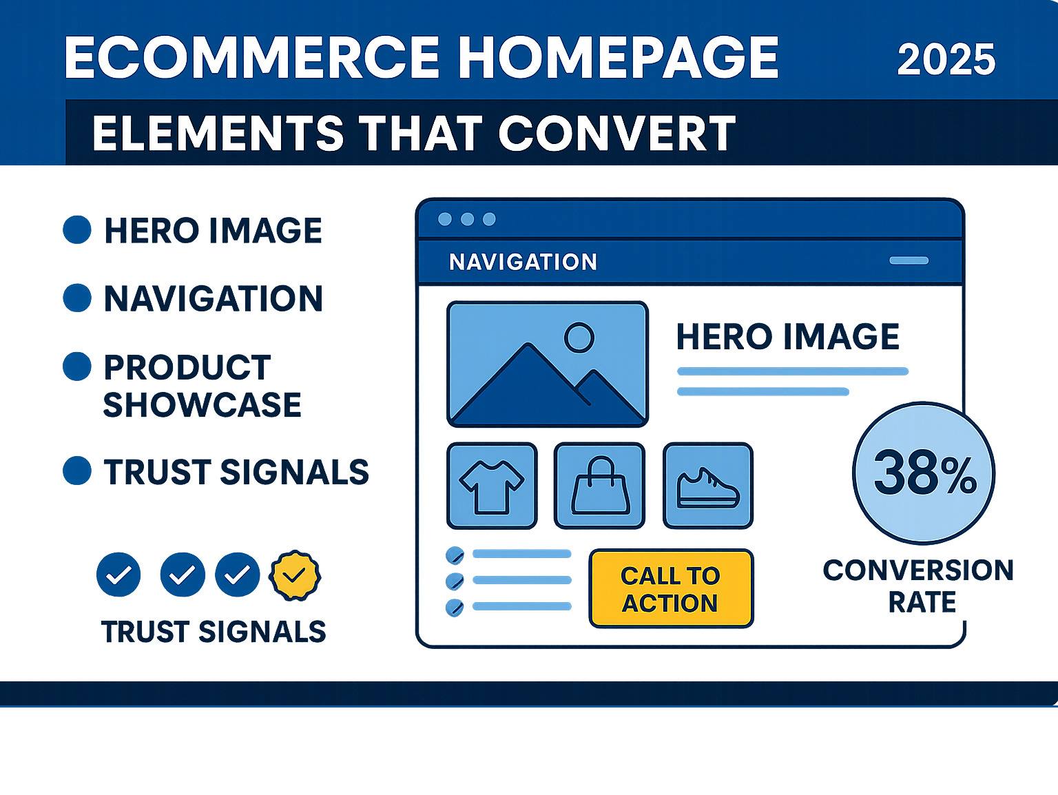
Looking at ecommerce homepage examples reveals one clear truth: your homepage makes or breaks first impressions. Research shows it takes just 50 milliseconds for visitors to decide if they'll stay on your site or leave. Here are the top ecommerce homepage elements that convert:
Essential Homepage Elements:
- Clear value proposition - Tell visitors what you do in 5 seconds or less
- High-quality visuals - Professional photography that showcases your products
- Simple navigation - Easy-to-find menu items and search functionality
- Strong calls-to-action - Obvious next steps for visitors to take
- Social proof - Customer reviews, testimonials, and trust badges
- Mobile optimization - Fast loading and touch-friendly design
Your homepage is where brand identity meets user experience. It's the digital version of a firm handshake and confident smile. The best ecommerce sites understand this balance perfectly.
Great homepage design isn't about following trends - it's about understanding your customers and removing every possible barrier between them and your products. When someone lands on your site, they should immediately understand what you sell, why they should care, and how to buy it.
The most successful online stores treat their homepage like their best salesperson. It needs to build trust quickly, emphasize key products, and direct visitors toward making a purchase. Every element should serve a purpose.
I'm Steve Pogson, founder of First Pier, a Shopify Expert Agency that has helped brands like Wyman's Blueberries and Hyperlite Mountain Gear create high-converting storefronts. Over two decades in ecommerce, I've examined countless ecommerce homepage examples to understand what drives results. Let me show you the designs that are setting the standard for online retail success.

Ecommerce homepage examples helpful reading:
Key Ingredients for a High-Converting Ecommerce Homepage
The best ecommerce homepage examples share something special: they work like your most talented salesperson, directing visitors naturally from "just browsing" to "add to cart." After helping hundreds of brands build successful online stores, I've learned that a great homepage isn't just pretty - it's a carefully crafted conversion machine.
Think of your homepage as a first date. You want to look your best, make a great impression, and leave them wanting more. But unlike dating, you have just 50 milliseconds to win them over. No pressure, right?
The secret lies in balancing beautiful design with smart functionality. Every element needs to earn its place by either building trust, showcasing your products, or moving visitors closer to a purchase. Let me walk you through the essential ingredients that distinguish the winners from the also-rans.
Visuals and Branding
Your visuals do the heavy lifting before visitors even read a single word. I've seen stores boost conversions by 40% simply by upgrading their images. That's not just a nice-to-have improvement - that's game-changing revenue growth.
High-quality photography is your foundation. Blurry, poorly lit product shots are like showing up to that first date in wrinkled clothes. Your images need to be crisp, well-lit, and consistent. Mix lifestyle shots that help customers picture themselves using your products with clean product images on neutral backgrounds.
Color psychology plays a bigger role than most people realize. Warm colors create feelings of excitement and urgency, while cool tones suggest trust and reliability. Choose your palette strategically to match your brand personality and direct customer emotions.
Typography speaks volumes about your brand before customers read your content. Stick to two fonts maximum and create clear hierarchy. A luxury jewelry brand might use neat serif fonts, while a tech startup could go with clean, modern sans-serif. Whatever you choose, make sure it's readable on mobile devices.
Brand consistency ties everything together. Your logo, colors, fonts, and imagery should tell the same story across every touchpoint. Customers need five to seven brand impressions to remember you, so consistency helps speed up that recognition and build trust.

If you're looking to strengthen your visual identity, our branding and identity services can help you create a cohesive brand that resonates with customers.
Navigation and User Experience
Beautiful design means nothing if customers can't find what they're looking for. Your navigation is like the floor plan of a well-designed store - it should direct people naturally to where they want to go.
Intuitive menus keep things simple and direct. Your main navigation should include just your core pages like Shop, About, and Contact. Resist the urge to cram everything into your header menu. Save secondary links for your footer where they won't create clutter.
Search bar placement matters more than you might think, especially for stores with large product catalogs. Make it prominent and easy to find. When customers know exactly what they want, don't make them hunt for it through category pages.
Mobile-first design isn't optional anymore - it's survival. Nearly 80% of customers shop on mobile devices, and Google prioritizes mobile-friendly sites in search results. Your homepage must look great and function perfectly on every screen size. I always tell clients to test their checkout flow on a phone first.
Fast loading speed can make or break that crucial first impression. You have 50 milliseconds to capture attention. A slow-loading page kills that opportunity before it starts. Optimize your images, clean up your code, and invest in reliable hosting.
Footer links handle the important but less exciting stuff like return policies, privacy policies, and FAQs. This keeps your main navigation clean while ensuring essential information is accessible when customers need it.
Our ecommerce UX design services focus on creating user experiences that feel effortless and drive conversions.
Trust and Credibility
Online shopping requires a leap of faith. Customers can't touch your products or look you in the eye, so your homepage needs to work extra hard to build credibility and trust from the first click.
Customer reviews and testimonials provide the social proof that turns browsers into buyers. When 82% of consumers check social media before making purchases, displaying positive reviews and star ratings prominently can tip the scales in your favor. Real customer photos add even more authenticity.
Security badges might seem boring, but they're trust-building powerhouses. Display accepted payment methods like Visa, Mastercard, and PayPal along with SSL security seals. Over 40% of shoppers will abandon a store if they're worried about data security, so make your security visible and obvious.
Clear return policies remove purchase anxiety. Don't hide this information in fine print - make it easy to find. A generous, transparent return policy actually encourages purchases by reducing the seen risk of buying online.
Contact information proves you're a real business with real people behind it. Include your email, phone number, and physical address if you have one. Make it easy for customers to reach you when they have questions or concerns.
Here's a pro tip: avoid forcing account creation during checkout. About 23% of customers will abandon their cart rather than create an account. Offer guest checkout to reduce friction and earn trust first.
Thesus does an excellent job building trust through clear policies and transparent communication with their customers.
Building trust takes time, but losing it happens instantly. Every element on your homepage should strengthen that you're a legitimate business that customers can count on.
Inspiring Ecommerce Homepage Examples That Get It Right
After working with countless brands over the years, I've noticed that the most successful ecommerce homepage examples share something special - they don't just showcase products, they tell stories. They create connections. They make visitors feel something before they even think about buying.
Let me walk you through some of the homepage approaches that consistently win customers over, organized by the unique challenges each industry faces.
Fashion & Apparel: Ecommerce homepage examples that sell a lifestyle
Fashion brands face a unique challenge: they're not really selling clothes. They're selling confidence, identity, and dreams. The best fashion homepages understand this completely.

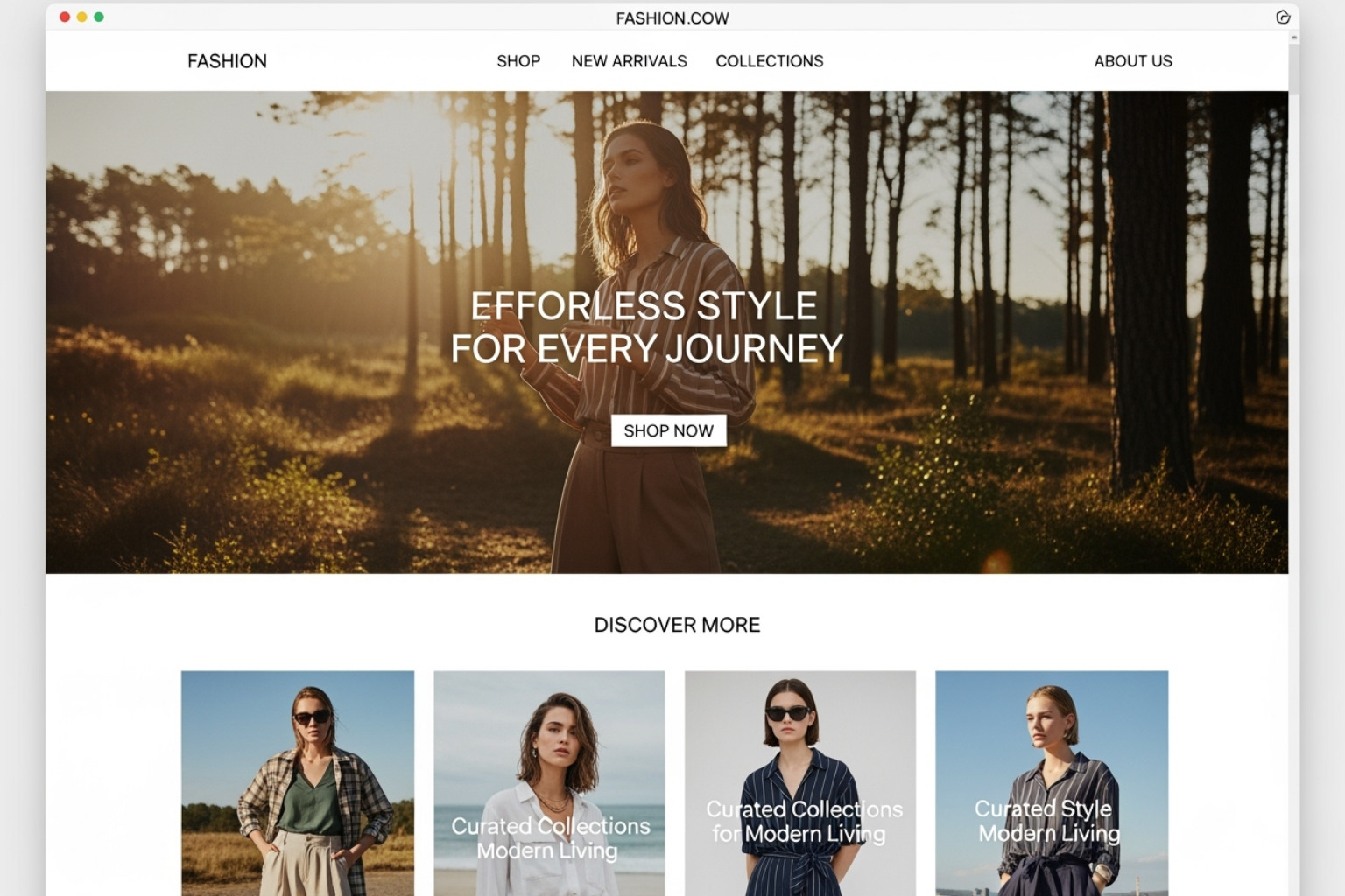
Take lifestyle imagery, for example. Instead of sterile product shots against white backgrounds, successful fashion sites show real people wearing their clothes in real situations. You see someone hiking in those boots, or laughing with friends in that dress. Suddenly, you're not buying fabric - you're buying the experience of being that person.
The brand voice in fashion is everything. Some brands are playful and irreverent, others are sophisticated and aspirational. The copy on these homepages reads like a conversation with your most stylish friend. It's confident without being pushy, descriptive without being boring.
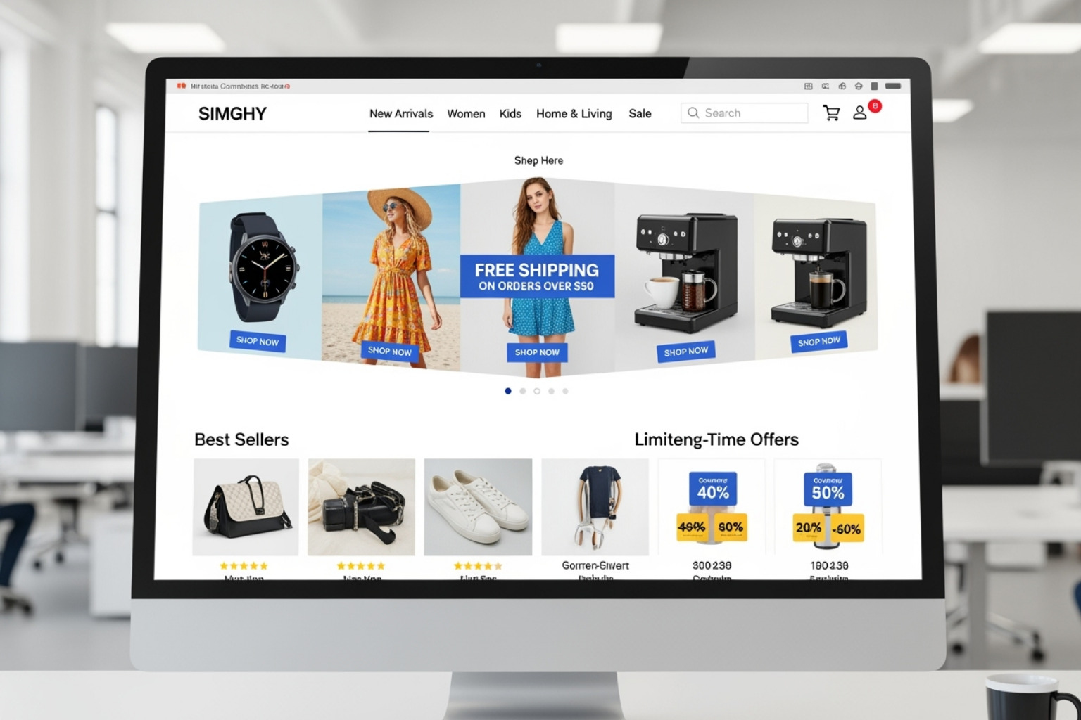
What really impresses me about great fashion homepages is their simple navigation. Despite having hundreds or thousands of products, they keep things clean. You might see broad categories like "New Arrivals," "Bestsellers," or seasonal collections front and center. They trust that once you're inspired by the lifestyle they're selling, you'll want to explore deeper.
Food & Beverage: Ecommerce homepage examples that make you hungry
Food brands have perhaps the toughest job online - they need to make you taste something through a screen. The ones that succeed understand that buying food online is about trust, craving, and convenience.

Appetizing photography is non-negotiable here. I'm talking about images that make your mouth water - steam rising from a cup of coffee, chocolate melting off a spoon, or fresh ingredients arranged like art. These photos don't just show the product; they trigger a physical response.
Social proof works incredibly well for food brands. When someone says "This coffee changed my mornings!" or posts a photo of their kids actually eating those organic snacks, it carries more weight than any marketing copy could. Parents especially want to see other parents vouching for products they're feeding their families.
The smartest food homepages also emphasize clear product benefits beyond just taste. Is it organic? Does it save time? Is it perfect for people with dietary restrictions? They answer the practical questions while still making you crave the product.
Unique & Niche Brands
These are honestly my favorite ecommerce homepage examples to study because they throw the rulebook out the window. They're serving specific audiences who are looking for something different, and their homepages reflect that boldness.

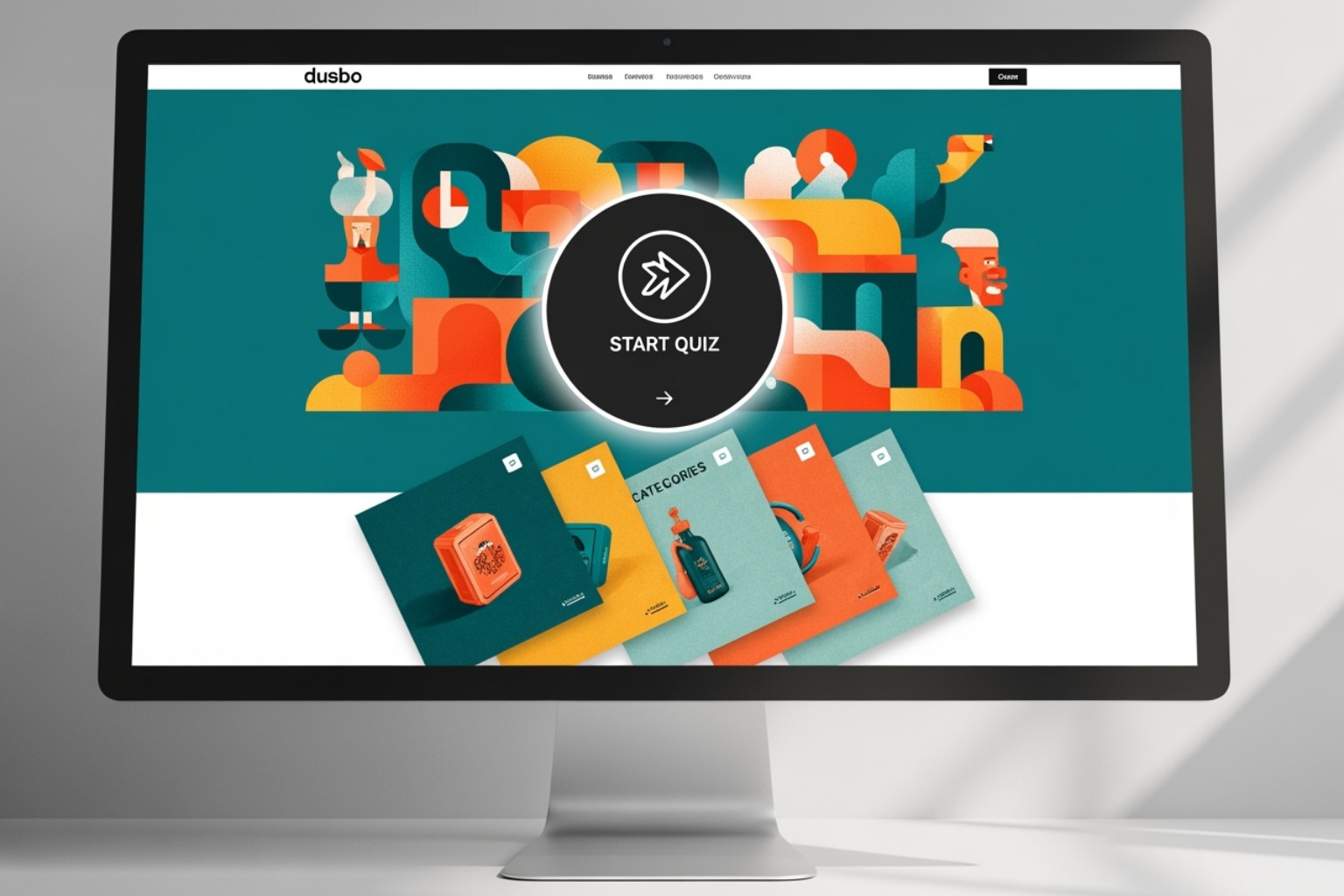
Strong personality is what sets these brands apart. They use bold colors, unexpected copy, custom illustrations, or unique layouts that you'd never see on a mainstream site. They're not trying to appeal to everyone - they're trying to deeply connect with their specific tribe.
Interactive elements really shine on these homepages. Product quizzes that help you find the perfect match, 3D models you can rotate and examine, animations that respond to your scrolling - these features turn browsing into an experience. When someone spends time interacting with your homepage, they're much more likely to make a purchase.
Many niche brands thrive on user-generated content. Customer photos, reviews, and stories create a sense of community that feels authentic. When you see real people using and loving these unique products, it builds confidence that you're not just buying something weird - you're joining something special.
One standout example that comes to mind completely imagines what a homepage can be. Instead of just listing products, they immediately communicate their unique value - maybe it's sustainable materials, premium quality, or solving a problem nobody else addresses. They use customer reviews and press mentions prominently, turning social proof into a central part of their story rather than an afterthought.
The best niche homepages understand that their customers are often passionate about the problem they solve or the lifestyle they support. They speak directly to that passion, creating an instant connection that goes way deeper than "here's our stuff, please buy it."
Common Homepage Mistakes (And How to Fix Them)
After examining thousands of ecommerce homepage examples over the years, I've noticed the same mistakes popping up again and again. These aren't just minor design flaws - they're conversion killers that can cost you serious revenue. The good news? They're all fixable with the right approach.
Cluttered design is probably the biggest offender I see. When businesses try to cram everything onto their homepage - rotating banners, multiple pop-ups, walls of text, and every product they sell - visitors get overwhelmed fast. You have just 50 milliseconds to make that first impression count. A chaotic homepage makes that decision easy: they leave.
The fix is simpler than you might think. Focus on creating a clear visual hierarchy with plenty of white space. Think of your homepage like a well-organized store window - you want to showcase your best products without creating visual noise. Every element should have breathing room and a clear purpose.
Weak or missing calls-to-action are another major problem. I've seen gorgeous homepages that leave visitors wondering "okay, now what?" A vague "Click Here" button or burying your main CTA below the fold is like having a salesperson who forgets to ask for the sale.
Make your CTAs impossible to miss. Use action-oriented language like "Shop Now," "Find Your Style," or "Start Building." Each section of your homepage should direct visitors toward a specific next step. The best ecommerce homepage examples treat every CTA like a helpful signpost pointing customers in the right direction.
Poor quality images can instantly destroy credibility. Blurry product photos, inconsistent lighting, or low-resolution images make even premium products look cheap. Since images can improve conversion rates significantly, this mistake hits you where it hurts most - your bottom line.
Professional photography is worth the investment. Your images should be crisp, well-lit, and consistent in style. They need to load quickly too, so optimize them for web use. Think of your product photos as your silent sales team - they need to work hard to convince customers to buy.
Confusing navigation frustrates visitors before they even start shopping. When customers can't find what they're looking for within seconds, they'll bounce to a competitor who makes it easier. Complex mega-menus, unclear category names, or hiding the search bar all create unnecessary friction.
Keep your main navigation simple and intuitive. Use clear labels that your customers would actually search for. Place your search bar prominently - it's especially crucial for stores with large inventories. Important but less-frequently-used links like shipping policies and contact info work well in your footer.
Ignoring mobile users is like turning away 80% of your potential customers. With nearly four out of five shoppers using mobile devices to make purchases, a homepage that doesn't work smoothly on phones and tablets is a business killer.
Mobile-first design isn't optional anymore. Test your homepage on different devices and screen sizes regularly. Make sure buttons are easy to tap, text is readable without zooming, and the checkout process works flawlessly on smaller screens.
Hiding important information creates suspicion and kills trust. When customers can't easily find your contact details, return policy, or shipping information, they start wondering what else you might be hiding. Over 40% of shoppers will abandon a store they don't trust with their data.
Be completely transparent. Make your contact information easy to find, display security badges prominently, and link to your policies in the footer. Don't force customers to create accounts either - about 23% will abandon their cart rather than go through that hassle. Offer guest checkout to reduce friction and build trust first.
Here are the top 5 homepage mistakes to avoid:
- Overwhelming visitors with too much information at once
- Using weak or unclear calls-to-action
- Displaying poor quality or inconsistent product images
- Creating confusing or overly complex navigation
- Failing to optimize for mobile devices
The best part about fixing these mistakes? You don't need a complete redesign. Small, strategic changes to address these issues can dramatically improve your conversion rates and create a homepage that actually works as hard as you do.
Frequently Asked Questions about Homepage Design
After working with hundreds of brands over the years, I've noticed that business owners often ask similar questions about ecommerce homepage examples and design. Let me share the answers to the most common ones I hear.
How do I make my homepage stand out?
Standing out isn't about following the latest design trends or copying what everyone else is doing. It's about being authentically you and making that crystal clear to visitors.
Focus on your unique brand story first and foremost. What drove you to start this business? What problem are you solving that others aren't? I've worked with brands that started because the founder couldn't find the right product for their own needs - that's a powerful story that connects with customers who have the same problem.
Use high-quality, original images and videos that actually represent your brand and products. I can spot a generic stock photo from a mile away, and so can your customers. When we worked on redesigning homepages, the brands that invested in custom photography always saw better engagement. Your visuals should feel like they could only belong to your brand.
Create a clear value proposition that immediately tells visitors what makes you different. This isn't just what you sell, but why someone should choose you over the dozens of other options they could find. Maybe you're the only company that offers lifetime repairs, or perhaps you donate a percentage of profits to environmental causes. Whatever it is, make it obvious within those first few seconds.
What is the most important element on a homepage?
If I had to choose just one element that makes or breaks a homepage, it would be a clear and compelling call-to-action. I've seen beautiful homepages that completely failed because visitors had no idea what to do next.
Your CTA directs people to take the next logical step, whether that's browsing your bestsellers, checking out a new collection, or signing up for your newsletter. Without it, even interested visitors will just wander around your site and eventually leave.
The key is making your CTAs feel natural and helpful rather than pushy. Instead of a generic "Click Here," try something like "Shop Our Award-Winning Collection" or "Find Your Perfect Match." Place them where it makes sense in the customer experience - after you've given someone a reason to care about what you're offering.
How often should I update my homepage?
This is one of those questions where the answer is "it depends," but I can give you some practical guidelines that work well.
Update your homepage for major promotions, new product launches, or seasonal campaigns. Your homepage should reflect what's most important in your business right now. If you've just launched a summer collection or you're running a Black Friday sale, that deserves prime real estate on your homepage.
A minor refresh every 1-3 months keeps things feeling current without overwhelming your regular customers. This might mean swapping out some product photos, updating customer testimonials, or highlighting different categories. Small changes can make a big difference in keeping your site feeling fresh.
Here's what I always tell my clients: avoid constant major changes that could confuse repeat visitors. Your homepage shouldn't look completely different every time someone comes back. People need to feel familiar with your brand, and consistency builds trust. Think development, not revolution.
The best approach is to track how changes affect your conversion rates. If a small update leads to more sales, you're on the right track. If it causes confusion or lower engagement, you can always roll it back.
To Sum Up: Start Building a Better Homepage
Looking back at all these ecommerce homepage examples, you might notice something interesting: there's no magic formula or one-size-fits-all template for success. What works for a fashion brand selling lifestyle dreams won't necessarily work for a food company making mouths water. But here's what I've learned after two decades in ecommerce - the best homepages all share some fundamental truths.
Design for the user, always. Your customer's experience should drive every decision you make. When someone lands on your homepage, they shouldn't have to think hard about what you sell or how to buy it. Make their path to purchase as smooth as possible. Remove friction wherever you find it.
Let your brand personality shine through. Your homepage isn't just a product catalog - it's your brand's digital storefront. Whether you're quirky and fun like Death Wish Coffee or sophisticated and neat like a luxury fashion brand, make sure that personality comes through in every visual element, every word of copy, and every interaction.
Think of your homepage as your best salesperson - one who never takes a break, never has a bad day, and works around the clock to make great first impressions. This digital employee builds trust with security badges and customer reviews, showcases your best products with stunning visuals, and directs visitors toward making a purchase with clear calls-to-action.
The investment you make in getting your homepage right pays dividends every single day. You have just 50 milliseconds to make that crucial first impression. Make them count.
At First Pier, we've helped brands across every industry create homepages that don't just look beautiful - they convert visitors into customers. We understand that building a high-performance online business takes more than just good looks. It takes strategy, user experience expertise, and a deep understanding of what makes people buy.
Ready to transform your homepage into a conversion powerhouse? Let's talk about how our award-winning ecommerce agency can help you build a homepage that truly works for your business.


.png)
.png)
