

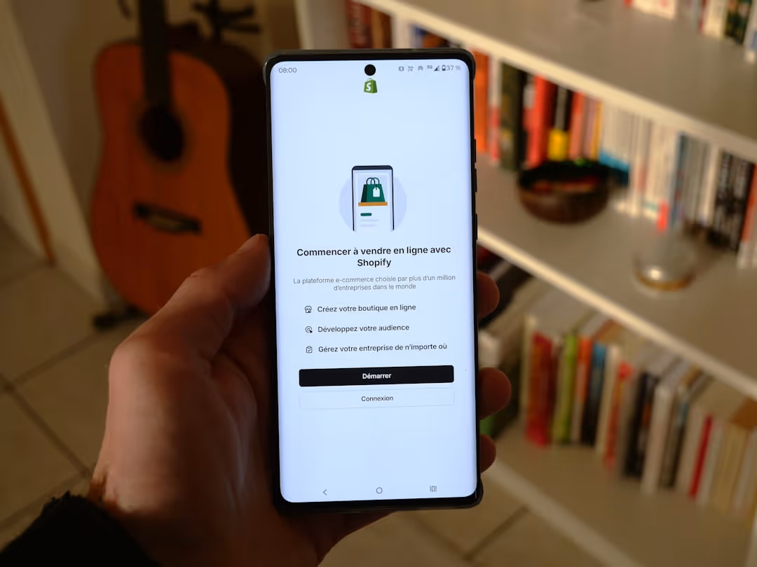

Why Your Store Needs to Be Mobile-Friendly
A mobile ecommerce website is an online store designed and optimized specifically for smartphones and tablets, featuring responsive design, fast loading times, and touch-friendly navigation to provide seamless shopping experiences on small screens.
Key Elements of a Successful Mobile Ecommerce Website:
- Fast loading speeds (under 3 seconds)
- Responsive design that adapts to all screen sizes
- Touch-friendly navigation with large, tappable buttons
- Simplified checkout process with mobile payment options
- High-quality product images optimized for mobile viewing
- Easy-to-use search functionality
- Guest checkout options to reduce friction
Your customers have already made the change to mobile shopping. Research shows that 79% of mobile users have made online purchases using their smart devices as of 2023. This isn't just a trend - it's the new reality of how people shop.
The numbers tell a compelling story. Mobile commerce is expected to reach over $700 billion in the coming years, and mobile app users convert at a 3x higher rate than mobile web users. Even more striking, 53% of website visitors expect an ecommerce site to load in 3 seconds or less on mobile, and half of all online shoppers will abandon their cart if your site loads too slowly.
But this change brings both opportunity and challenge. While mobile opens doors to reach customers anywhere, anytime, it also demands a completely different approach to design and user experience. What works on desktop often falls flat on a 6-inch screen.
I'm Steve Pogson, and over two decades of scaling online businesses, I've seen how crucial it is to get your mobile ecommerce website right from the start. As the founder of First Pier, I've helped leading brands like Wyman's Blueberries and Hyperlite Mountain Gear create mobile experiences that don't just look good - they convert visitors into loyal customers.

Find more about mobile ecommerce website:
Building Blocks of a Great Mobile Ecommerce Website

Building a successful mobile ecommerce website is like constructing a house - you need a solid foundation and the right materials. After helping hundreds of businesses create mobile stores that actually convert, I've learned that success comes down to four key elements that work together well.
Think of your mobile site as your customer's pocket-sized storefront. Every tap, swipe, and scroll should feel natural and effortless. When someone pulls out their phone to shop, they want instant results, not frustration.
Speed and Performance: The Need for Speed
Here's the hard truth: if your mobile ecommerce website takes longer than three seconds to load, half your customers will give up and shop somewhere else. I've seen businesses lose thousands in sales simply because their pages crawled instead of sprinted.
Speed isn't just about keeping customers happy - it directly impacts your bottom line. When pages load quickly, people stay longer, browse more products, and complete their purchases. It's that simple.
The secret to lightning-fast mobile performance starts with image compression. Your product photos need to look stunning, but they shouldn't weigh down your site. I always recommend using the WebP format, which can make images 25-34% smaller than traditional JPEGs without losing quality. It's like having your cake and eating it too.
Fast hosting is your website's engine - you can't have a race car running on a lawn mower motor. Investing in quality hosting pays for itself through better customer experiences and higher conversion rates.
Learn more about Mobile Optimization for Ecommerce.
Simple Navigation and Clean Design
When you're designing for a screen that fits in someone's palm, every pixel matters. I've found that the best mobile sites feel almost invisible - customers find what they need without thinking about the interface.
An intuitive layout starts with understanding how people use their phones. Most hold their device with one hand and guide with their thumb. This means your most important elements - like the hamburger menu and prominent search bar - should sit in the thumb-friendly zone at the top of the screen.
Clear categories act like signposts in your digital store. When someone lands on your homepage, they should instantly understand how to find what they're looking for. I always tell clients to think like their customers: if you sold outdoor gear, would someone immediately know where to find hiking boots versus camping equipment?
Negative space might seem like wasted real estate, but it's actually your secret weapon. White space around buttons and text makes everything easier to read and tap. Plus, large, tap-friendly buttons prevent the frustration of accidentally tapping the wrong thing - a surefire way to lose a sale.
Find out more about User Experience (UX).
Impressive Visuals: Show, Don't Just Tell
On mobile, your visuals need to work twice as hard because screen space is limited. I always tell clients that high-quality product photos aren't optional - they're essential. But static images only tell part of the story.
Product videos and 360-degree views let customers examine items almost like they're holding them. This is especially powerful for products where texture, fit, or functionality matters. I've seen conversion rates jump significantly when businesses add these interactive elements.
Lifestyle images help customers picture themselves using your products. Instead of just showing a coffee mug on a white background, show someone enjoying their morning coffee in a cozy kitchen. These emotional connections drive purchases.
Visual consistency across your site builds trust and reinforces your brand. When every image, color, and font choice feels intentional and cohesive, customers see your business as professional and reliable.
Find out more about Ecommerce Website Design Tips.
The Mobile-First Approach Explained
Here's where many businesses get it backwards. Instead of building for desktop and then squeezing everything onto mobile, I start with the smallest screen first. This mobile-first approach forces you to focus on what really matters.
When you're designing for small screens first, you naturally prioritize the most important content and features. Every element has to earn its place on the screen. This creates a better user experience because there's no clutter or confusion - just the essential information customers need to make a purchase.
Google loves mobile-first design too, which means Google ranking benefits for your business. Since most searches happen on mobile devices, Google prioritizes sites that work well on phones and tablets. It's a win-win situation.
The beauty of mobile-first design is its scalability. When you start with constraints and then expand, your site looks great on every device. A mobile-first site naturally adapts to tablets and desktops, but the reverse isn't always true.
Find out more about Responsive Design for Mobile.
Optimizing Key Pages for Mobile Shoppers
Here, we'll look at how to make your most important pages work perfectly on a phone to help turn visitors into customers.

Now that you've built a solid foundation for your mobile ecommerce website, it's time to focus on the pages that actually make you money. Your product pages and checkout process are where browsers become buyers – or where they give up and leave. Get these right, and you'll see your conversion rates climb.
Think about your own mobile shopping habits. You probably want to see what you're buying quickly, understand the key details without scrolling forever, and checkout without typing your life story. That's exactly what your customers want too.
Creating High-Converting Product Pages
Your product page needs to sell without being pushy. The clear call-to-action button – that bright, impossible-to-miss "Add to Cart" – should be large enough to tap easily. I recommend making it sticky so it follows users as they scroll. Nothing's more frustrating than having to hunt for the buy button after you've decided you want something.
Concise product descriptions work best on mobile. People scan, they don't read novels on their phones. Break information into bite-sized chunks with plenty of white space. Use expandable sections for detailed specs or care instructions – this keeps the main page clean while still providing all the information detail-oriented shoppers need.
Customer ratings and reviews are pure gold on mobile. They provide instant social proof right where people are making buying decisions. Place them prominently near your product images, not buried at the bottom of the page.
Make selecting product options like size or color as simple as tapping large, visual buttons. Dropdown menus are clunky on mobile – color swatches and size buttons work much better. And don't forget high-resolution images with zoom capability. Mobile shoppers can't pick up and examine your products, so crystal-clear photos that they can pinch to zoom become their hands and eyes.
Trust badges – those little icons showing secure payments or return policies – might seem small, but they pack a big psychological punch. Place them near your add-to-cart button where last-second doubts tend to creep in.
Streamlining the Mobile Checkout Process
Here's where many mobile sales go to die. I've seen businesses lose half their potential customers between "Add to Cart" and "Order Complete" simply because their checkout process was too complicated.
Guest checkout isn't optional – it's essential. Forcing someone to create an account when they just want to buy something is like asking for their life story before they can enter your physical store. Let them buy first, then invite them to create an account afterward.
A progress bar showing how many steps remain in checkout reduces anxiety. When people can see they're almost done, they're more likely to push through to completion.
Digital wallets like Apple Pay and Google Pay are game-changers for mobile checkout. One tap, and the purchase is complete. No typing addresses on tiny keyboards, no digging through wallets for credit cards. These payment methods can cut your checkout time from minutes to seconds.
Auto-fill forms and minimal required fields respect your customers' time and patience. Only ask for information you absolutely need. If you can calculate shipping costs without requiring a phone number, don't ask for one. Every extra field is another chance for someone to get frustrated and leave.
Secure payment icons should be clearly visible throughout checkout. Mobile shoppers are often on public Wi-Fi or in unfamiliar environments, so they need extra reassurance that their payment information is safe.
Learn more about Conversion Rate Optimization (CRO).
Mobile Website vs. Mobile App: What's Right for You?
Deciding between a mobile-friendly site and a dedicated app can be tough. This section explains the pros and cons of each so you can make the best choice for your business.
This is one of the most common questions I get from clients: "Should I build an app, or is my mobile ecommerce website enough?" The answer isn't always straightforward, and it really comes down to understanding your customers and business goals.
Here's the thing - both options have their place, but they serve different purposes. Let me break down what I've learned from years of helping businesses make this decision.
FeatureMobile WebsiteMobile AppCostGenerally lower development and maintenanceHigher development and ongoing maintenanceReachWider audience (anyone with a browser)Limited to users who download the appUser ExperienceGood, responsive to device sizeExcellent, often faster and more interactiveUpdatesReal-time, server-sideRequires app store updatesSEOIndexable by search engines (Google, etc.)Not directly indexable by web search enginesFeaturesAccess to basic device features (camera, GPS)Full access to device features (push notifications, offline, etc.)MaintenanceSimpler, single codebaseMore complex, native code for each OS
The Case for a Mobile-Optimized Website
For most businesses I work with, especially those just getting started or looking to cast a wide net, a well-optimized mobile ecommerce website is the smart choice. Think about it this way - your website is like having a storefront that's open to anyone walking by, while an app is more like an exclusive club that people have to join first.
The wider audience reach is huge. Anyone with a web browser can find and shop with you, whether they're on an iPhone, Android, or even an older device. There's no barrier to entry - no downloads, no app store approvals, no wondering if you have enough storage space.
From a business perspective, it's more cost-effective too. You're building and maintaining one responsive site instead of separate apps for different operating systems. When I need to make changes for a client, I update the website once, and boom - it's live for everyone immediately. No waiting for app store reviews or worrying about users who haven't updated yet.
The SEO benefits are something you simply can't ignore. Google can find your products, your content, your special offers. New customers can stumble upon your business through search, which is how many great customer relationships begin. An app just can't do that.
Find out how responsive design works.
When to Consider a Mobile App
Now, I'm not saying apps don't have their place. If you have loyal, repeat customers who shop with you regularly, an app might make sense. People spend about 90% of their mobile time in apps, so being part of that daily routine can be powerful.
Push notifications are the app's secret weapon. Imagine being able to gently remind customers about items in their cart or let them know about a flash sale. It's direct communication that doesn't get lost in email spam folders.
Apps also offer faster access once they're installed. No typing in URLs or waiting for pages to load from scratch. For businesses that rely on quick, frequent purchases, this speed can make a real difference.
If your products benefit from device features like the camera for virtual try-ons or GPS for location-based offers, an app gives you more tools to play with. Some apps even work offline, which can be handy for customers in areas with spotty internet.
Note: First Pier specializes in building high-performance mobile ecommerce websites. If you're considering an app, think about whether your business truly needs one, or if a well-optimized mobile site can meet your goals.
The truth is, most businesses should start with a solid mobile website. Get that right first, build your customer base, and then consider whether an app would add real value. Don't let the excitement of having an app distract you from creating an amazing mobile web experience that actually drives sales.
Future-Proofing Your Mobile Store with Modern Tech
Technology is always changing. Let's explore some modern tools and trends that can give your mobile store an edge.

The world of ecommerce never stands still, and your mobile ecommerce website shouldn't either. What worked last year might feel outdated tomorrow. That's why I always encourage my clients to think ahead and build stores that can grow with new technology.
The good news? You don't need to chase every shiny new trend. Instead, focus on technologies that genuinely make shopping easier and more enjoyable for your customers. I've found that the most successful mobile stores are the ones that thoughtfully integrate new features without overwhelming their users.
Using AI to Create a Smarter Shopping Experience
Artificial intelligence might sound intimidating, but it's already working behind the scenes in ways that feel natural and helpful. When I help clients set up AI product recommendations, we're essentially giving their store a smart assistant that learns what each customer likes.
Think about it this way: when you walk into your favorite local shop, the owner remembers what you bought last time and suggests things you might enjoy. AI does the same thing, but for thousands of customers at once. Personalized homepages change based on what someone has looked at before, making each visit feel custom just for them.
I'm also seeing great results with AI-generated product descriptions that maintain a consistent voice across hundreds of items, saving business owners hours of writing time. And chatbots for 24/7 support? They're not trying to replace human connection - they're handling the simple questions so your team can focus on the conversations that really matter.
Read about AI product recommendations.
The Power of Personalization
Here's what I've learned after years of building online stores: customers don't want to feel like just another number. Personalization is about creating those little moments that make someone think, "This site gets me."
Custom content that changes based on where someone is shopping from, location-based offers that feel relevant to their area, and recently viewed items that help them pick up where they left off - these aren't just nice features. They're what turn casual browsers into loyal customers.
I love watching how dynamic marketing campaigns adapt to different customer behaviors. Someone who browses but never buys might see different messages than someone who's a regular customer. It creates a smoother customer experience that feels less like marketing and more like helpful suggestions from a friend.
Social Commerce and Marketing Integration
Your customers are already spending time on social media, scrolling through Instagram and Facebook. Why not meet them where they are? Shoppable Instagram posts and Facebook Shops let people buy without ever leaving their favorite apps.
I've seen small businesses transform their reach through social media advertising that drives traffic directly to their mobile ecommerce website. The key is making the transition smooth - someone sees a product they love on Instagram, taps it, and lands on a mobile page that's just as beautiful and easy to use.
The magic happens when social media and your mobile store work together, creating multiple touchpoints that guide customers naturally toward a purchase.
More info about a Mobile Commerce Strategy.
Frequently Asked Questions about a mobile ecommerce website
When I talk with business owners about building their mobile ecommerce website, I notice the same questions come up again and again. Let me share the answers to the ones I hear most often, along with some practical advice I've learned from years of helping businesses succeed online.
How much does it cost to create a mobile ecommerce website?
This is probably the first question every business owner asks, and honestly, the answer depends on what you're trying to build. If you're just starting out or have straightforward needs, website builders can be a great option with monthly costs typically ranging from around $27 to $159. These platforms give you the basics and can get you up and running quickly.
But here's the thing - if your business has unique requirements, needs special integrations with your existing systems, or requires a completely custom design that reflects your brand perfectly, you're looking at custom development. This investment can run into several thousand dollars, but it's often worth it for businesses that need something truly custom to their needs.
At First Pier, we work closely with each client to create solutions that fit both their vision and their budget. Every business is different, and your website should reflect that.
How can I boost my mobile site's SEO?
I'm glad you asked this - it's something I'm passionate about because good SEO can make or break a mobile ecommerce website. The foundation is speed. If your site takes forever to load on mobile, search engines notice, and so do your customers. We aim for loading times under three seconds.
Next, you need a genuine mobile-first design approach. This isn't just about making your desktop site smaller - it's about rethinking the entire experience for mobile users from the ground up. Google rewards sites that truly work well on mobile devices.
Content quality matters too. Keep creating valuable, helpful content that answers your customers' real questions. And make sure your site is genuinely easy to use on a small screen. Think large, tappable buttons, clear navigation, and simple checkout processes. When Google sees that people can easily use your site on mobile, it helps boost your rankings.
Find out more about Ecommerce SEO Strategies.
What is the most important element of a mobile ecommerce website?
If I could only focus on one thing, it would be simplicity. This might sound basic, but it's the thread that connects everything else that makes a mobile site successful.
Think about it - when you're shopping on your phone, maybe you're standing in line at the coffee shop or sitting on the couch after a long day. You don't want to wrestle with a complicated website. You want to find what you need, understand your options, and buy it without any hassle.
A simple, fast, and easy-to-use site that lets customers find products and complete their purchase without friction is what separates successful mobile stores from the ones that frustrate customers into leaving. Complex designs, slow loading times, or confusing navigation will send people straight to your competitors, no matter how amazing your products are.
Keep it simple, keep it clear, and keep it direct. When you do that, your mobile ecommerce website will not just survive - it will thrive.
To Sum Up: Your Next Steps to Mobile Success
Building a successful mobile ecommerce website really comes down to one simple truth: your customers' experience should be at the heart of everything you do. When you focus on creating a site that loads quickly, offers simple navigation, and makes checkout a breeze, you're not just building a website—you're creating a pocket-sized store that works as hard as you do to drive sales and keep customers coming back for more.
Think about it this way: every tap, swipe, and scroll on your mobile site is an opportunity to either delight your customers or frustrate them. The businesses that win are the ones that make every interaction feel effortless and enjoyable.
Throughout this guide, we've covered the essential building blocks—from the need for speed to the power of AI and personalization. But knowing what to do and actually implementing it are two different things. That's where having the right partner makes all the difference.
If you're feeling overwhelmed by all the moving pieces or just want to make sure you get it right the first time, you don't have to go it alone. The team at First Pier has been helping businesses like yours build high-performance Shopify stores that truly shine on mobile devices. We understand that every business is unique, and we work closely with our clients to bring their vision to life in a way that connects with their customers and drives real results.
Ready to take the next step? Your mobile-first future starts now, and we're here to help you make it happen.


.png)
.png)

