Why Shopify Store Design Matters for Your Business

Summary
- Key areas for Shopify store design include visual identity (typography, color), user navigation (mobile-first), product pages (imagery, CTAs), trust signals (accessibility, performance), and analytics for refinement.
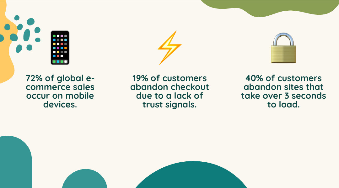
- Mobile commerce represents 72% of global e-commerce sales, so responsive design and fast load speeds are necessary for conversions.
- High-converting product pages require benefit-focused descriptions, multiple high-quality images, clear CTAs, and social proof like customer reviews.
- Site performance affects revenue, as 40% of customers will leave a site that takes over 3 seconds to load, and 19% abandon checkout if they do not trust the site.
- A successful store design uses elements like white space, consistent product photography, clear policies, and personalized recommendations to guide customers to purchase.

Your Shopify store design tips start with understanding that your store's design is more than aesthetics. It directly affects revenue, customer trust, and long-term growth. In the current e-commerce market, the difference between a store that converts and one that doesn't often comes down to design decisions—from how quickly your pages load to where you place your 'Add to Cart' button.
The stakes are clear. When 40% of customers abandon sites that load too slowly, and 19% leave at checkout because they don't trust the merchant, your design choices have immediate financial consequences. But good Shopify store design goes beyond avoiding these pitfalls. It's about creating a clear path that guides customers from finding a product to purchasing it, building confidence with each interaction, and reflecting your brand's unique value.
Here at First Pier, I'm Steve Pogson, and over two decades I've worked with brands like Wyman's Blueberries and Hyperlite Mountain Gear to apply shopify store design tips that build online stores into effective sales channels. The principles that follow come from real-world experience building and improving Shopify stores that grow.
Find more about shopify store design tips:
Foundational Design: Branding, Layout, and Visuals
When I think about the core elements of effective Shopify store design, I always start with the foundation: visual appeal, brand identity, and the overall user experience. Design is a form of communication with your customer. It presents information and can affect purchasing decisions. A well-designed website works well and reflects your brand's character.
Building a strong brand identity is crucial. It includes more than just a logo; it covers everything from your color palette and typography to the consistency of your imagery. These elements work together to create a consistent look that appeals to your customers. For more information on creating a strong brand, explore our branding identity services.
Choosing a Visual Direction: Minimalist vs. Bold
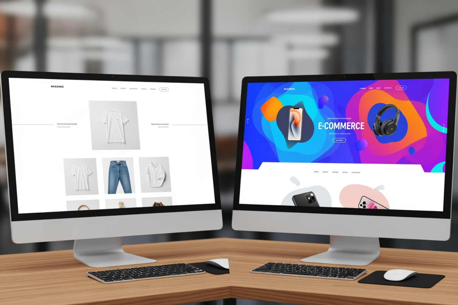
One of the first significant design decisions you'll make is choosing your store's overall visual direction. This often comes down to a choice between a minimalist approach or a bold and dynamic one.
Minimalist design principles can greatly improve a Shopify store's conversion rates by letting your products stand out. Imagine walking into a high-end boutique where every item has room to breathe. That's the effect of a minimalist online store. It uses clean, uncluttered product galleries, white space, clear messaging, and simplified navigation. This approach reduces visual clutter, making it easier for customers to focus on what matters: your products.
On the other hand, a bold and dynamic design approach is more suitable when your brand personality is vibrant, energetic, or unconventional. If your products are colorful, artistic, or make a strong statement, your store design should reflect that. This could mean using vibrant color schemes, dynamic animations, playful typography, and interactive elements. It's about creating a site that matches the energy of your brand and products. Not every brand needs the minimalist treatment; sometimes, bold is beautiful and more effective.
The key is to align your design choice with your brand and your products.

The Role of Typography and Color
Typography and color are important visual cues that influence brand perception and user behavior.
Typography plays a significant role in your Shopify store's branding and user experience. It sets the tone, guides the reader's eye, and creates visual hierarchy. A legible font is non-negotiable, but your choice of typeface also conveys your brand's personality. I recommend choosing one to two complementary typefaces for your branding, perhaps with a third as an accent. This avoids overwhelming visitors and helps create a stronger, more recognizable site. For instance, a brand keeping typography simple and consistent can be seen across the Numod website. You can also license premium typefaces from independent foundries like Klim and Commercial for a distinctive brand presence.
Color palettes are also important. Your website's colors should align with your brand's identity and affect how your customers feel. High-contrast color combinations are crucial for legibility, especially for navigation and important text. I often advise against pure white backgrounds, as they can be fatiguing for the eye on backlit screens. Instead, consider off-white or slightly dark charcoal for backgrounds to create a softer, more considered feel. You can add bold color accents through visual elements like photography and product packaging. Your brand colors will make a stronger statement if there are fewer of them, creating a more focused visual identity.
Crafting an Intuitive User Journey: Navigation and Search
A clear path for customers is essential for any successful e-commerce store. My goal is always to make it easy for customers to find what they need, browse products, and complete their purchase. This means focusing on user-friendliness, finding products, and anticipating customer needs. If you need help with this aspect, our e-commerce UX design services can provide expert guidance.
A Mobile-First Approach is Non-Negotiable
In 2025, a mobile-first approach is not just a best practice; it's critical for Shopify store design. Mobile commerce continues to be on the rise, with as much as 72% of global e-commerce sales transactions taking place on mobile in 2023 alone. My experience shows that if your mobile site isn't working well, you're losing sales.
Designing for mobile first means designing for smartphone users first before adapting it for larger screens. This includes large, easy-to-tap buttons, simplified menus, quick-loading images, and a simple checkout process. 40% of e-commerce customers abandon websites that take longer than 3 seconds to load. A responsive design ensures your site automatically adjusts based on the user's device, providing a consistent experience. For example, Coregami’s website features a fully responsive Shopify theme designed for consistent mobile and desktop shopping.
Optimizing Navigation and Search for Efficiency
Effective navigation and search functionality are essential for user-friendliness and efficiency. Your store's navigation should feel as intuitive as walking through a well-organized physical shop.
I recommend clear categories and a logical structure for your main menu. Even with a wide collection of products, a brand like Chala Handbags shows how a menu can remain easily navigable through well-structured main menus. You don't need to reinvent the wheel here; standard placements for navigation links (left-hand side), your logo (center), and tools like search and the shopping cart (upper right-hand corner) are what users expect.
A prominent and functional search bar is also important. Make sure it's immediately available, perhaps with autocomplete functionality and designed for human error with suggested results and autocorrect.
Product filtering and thematic filters significantly improve the shopping process by preventing "analysis paralysis" – the frustration that arises from too many options. Here are some best practices for product filtering:
- Show Applied Filters: Clearly display which filters are active so customers know exactly what they're seeing.
- Allow Filter Removal: Make it easy for customers to remove individual filters to widen their search without starting over.
- Truncate Filters: For categories with many options, show only the most popular filters at first glance, expanding to reveal more if needed.
- Use Thematic Filters: Beyond basic attributes like size and color, consider filters based on use, occasion, or style (e.g., "Evening Wear," "Work from Home essentials").
Designing High-Converting Product Pages
Your product pages must function like effective salespeople. They need to anticipate and answer every customer question, show the product's value, and guide them directly to a purchase. This is where many conversions happen, and it's an area I focus heavily on with our Shopify development services.
Key Shopify store design tips for product imagery and descriptions
High-quality imagery is a non-negotiable. Customers often rely on product images and videos to assess quality, details, and how to use it, especially when they can’t physically touch the product.

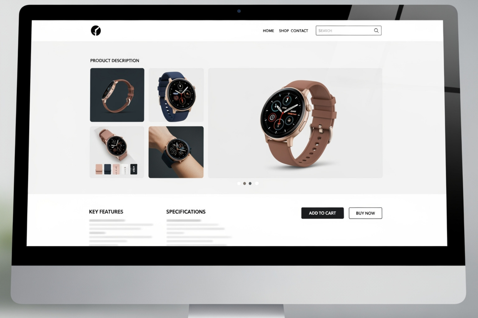
- High-Quality Product Photos: Use vivid, high-resolution, zoomable images that show your product from different angles. It’s wise to use a consistent style for your product photography so visitors see a consistent catalog.
- 360-Degree Views and Product Videos: These are very useful. Videos can show movement, texture, and how a product is used in real life. For hard goods, showing movement through hands conveys size and scale. For example, jewelry designer Jacquie Aiche’s website features videos and photos of brand ambassadors. It’s also now possible to easily display your products with dynamic 3D objects created directly in the Shopify app on an iPhone (Pro model). I recommend at least 3 images per product, especially for clothing.
- Benefit-Focused Descriptions: Avoid "marketing copy" overload. Your product descriptions should be clear, concise, and unique, focusing on the benefits your product offers rather than just features. Explain what problem it solves or how it improves a customer's life. Use progressive disclosure techniques to structure information clearly, providing a concise overview with bulleted key features, and allowing customers to find more details.
- Specifications Sheet: If your product's materials, weight, or technical qualities are important (e.g., for watches, electronics, or high-value items), include a specifications sheet. This helps customers compare and make informed decisions.
Designing Effective CTAs and Integrating Social Proof
The "Add to Cart" button is perhaps the most critical element on your product page. It needs to be prominent and effective. Use contrasting colors to make it stand out, and action-oriented phrases like "Buy Now" or "Shop Now." Sometimes, adding a sense of urgency can help, but use this carefully to avoid appearing manipulative.
Social proof is a proven way to increase conversions. People expect to see reviews. The research shows that reviews are 3x more authentic than brand-created content, and 88% of consumers trust online reviews as much as a personal recommendation.
- Customer Reviews and Testimonials: Make reviews clearly visible and easy to read on your product pages. Tools like Yotpo offer review modules that make it simple for customers to leave reviews, including photos and videos. Interestingly, having one negative review is often better than no reviews at all, as it adds authenticity and proves you're a real business.
- User-Generated Content (UGC): Show customer photos and videos. This authentic content builds credibility and helps potential buyers see how the product can be used.
- Cross-Selling and Upselling: Suggest complementary products on your product pages. This could be "frequently bought together" items or "complete the look" suggestions. An Ajax Cart (a pop-up mini cart) can help with this, allowing shoppers to add items without leaving the current page.
- Guest Checkout: Always offer a guest checkout option. "The site wanted me to create an account" is the second most common reason (35%) why customers abandon their checkout without purchasing anything.
Building Trust and Ensuring Peak Performance
Trust and performance are connected. A beautiful store that loads slowly or feels insecure will quickly lose customers. My approach here at First Pier always combines aesthetic design with solid technical work. For specialized help, our Shopify accessibility data compliance services can ensure your store meets important standards.
Essential Shopify store design tips for accessibility and speed
Website accessibility isn't just about compliance; it's about making the store usable for everyone. Shopify has built-in accessibility features, like the ability to add alt text to images. Including alt text is a low-effort, high-reward practice for both accessibility and SEO. I also advise adhering to WCAG (Web Content Accessibility Guidelines) standards. Shopify's Polaris accessibility considerations can provide guidance for designing your theme.
Improving performance is crucial. 40% of e-commerce customers abandon websites that take longer than 3 seconds to load. This is a hard truth I see often. Key areas to focus on include:
- Image Compression: Use optimized image formats and compress them to reduce file size without sacrificing quality.
- App Management: Remove unnecessary apps and combine features into fewer apps to reduce code bloat.
- Clean Code: A well-coded theme runs faster. If you're building a custom theme, prioritize clean, efficient code.
- Asynchronous Loading: Prioritize visible content and load less critical elements later.
- Disable Mobile Video Autoplay: This saves data and improves load times for mobile users.
Displaying Policies and Trust Badges
Transparency builds trust. Customers need to feel secure and informed before making a purchase. Lack of trust is cited as the reason why 19% of customers abandon at checkout.
- Clear Return Policy: Make your return policy simple, understandable, and easily accessible. Place links in your footer, FAQ, and directly on product pages.
- Accessible Shipping Info: This is a big one. People expect free shipping options to buy more items, order more often, and spend more on average. Clearly show shipping costs, delivery times, and any free shipping thresholds near the "Add to Cart" button.
- Payment Provider Logos and Security Badges: Show logos of accepted payment methods (Visa, Mastercard, PayPal, Klarna, etc.) and security badges (like SSL certificates) in your footer and at checkout. Shopify stores automatically ship with SSL, but visually reinforcing this helps build confidence.
Advanced Shopify Store Design Tips for Sustained Growth
Beyond the fundamentals, certain advanced methods can make your Shopify store stand out and support growth. This involves continuously improving how customers use the store, using data to make decisions, and using the platform's capabilities. Our e-commerce analytics analysis services can help you examine your data for this information.
Personalization and Interactive Elements
Personalization makes visitors feel like the experience is custom to them. Shoppers increasingly expect a personalized experience.
- Personalized Recommendations: Use apps or integrations to suggest products based on a customer's browsing history, past purchases, or items they've viewed. Integrations such as Web Personalizations by Optimizely, combined with Shopify collections and tags, help businesses group audiences and adapt page content accordingly.
- Dynamic Content: Adapt your homepage layout or promotions based on returning customers or specific audience segments.
- Interactive Elements: These change passive browsing into an interactive experience. Think quizzes that recommend products, virtual try-on tools, or product builders that allow customers to customize items. With Shopify's 3D scanning app, you can even display products with dynamic 3D objects, which can be created quickly on an iPhone (Pro model).
Choosing Between Ready-Made and Custom Themes
The choice between a ready-made theme and a custom-built one significantly impacts your design and features. The Shopify Themes store offers a wide selection.
| Feature | Ready-Made Themes (from Shopify Theme Store) | Custom Shopify Themes (built from scratch) |
|---|---|---|
| Cost | Generally lower (free to a few hundred dollars) | Higher initial investment |
| Speed | Faster to set up and launch | Longer development time |
| Customization | Limited to theme settings and sections; less unique | Full creative control; unique design custom to your brand |
| Features | Relies on built-in features and apps; may need workarounds | Built specifically for your business needs; direct integrations |
| Growth | Good for most businesses; may require adjustments for complex needs | Built for specific growth trajectory; highly adaptable |
| Maintenance | Updates are handled by the theme developer; potential for app conflicts | Requires ongoing development support; greater control over updates |
For many businesses, especially those starting out, a ready-made theme like Dawn (known for its excellent mobile performance) is a good starting point. However, as your brand grows and your needs become more specific, a custom theme developed by experts can provide a unique and efficient site. If you're considering a custom solution, our Shopify development services can help.
Using Analytics to Refine Your Design
Good design is never "done." It's an ongoing process of testing, learning, and refining. Analytics are your best friend here.
- A/B Testing: Experiment with different design elements—button colors, headline text, image layouts—to see what works best with your audience.
- Heatmaps and Visitor Recordings: Tools like Crazy Egg, Hotjar, and FullStory show you exactly how users interact with your pages. I use these to observe problem areas in detail, identifying where customers click, scroll, or hesitate.
- Goal Funnels: Connect Google Analytics to Shopify and set up a goal funnel. This shows precisely where customers are dropping off in their purchase journey, allowing you to find and fix usability problems.
By consistently analyzing data and making informed design adjustments, you can continually improve your store's performance and how customers use it.
Conclusion
To sum up, good Shopify store design tips are about creating a useful, clear, and well-performing online store. It's a continuous process of balancing strong branding, user-friendly navigation, good product presentation, trust-building elements, and solid technical performance. By making data-driven decisions and focusing on how customers use your store, you can help your brand grow and build lasting customer loyalty.
Here at First Pier, our team of experts focuses on creating well-performing online businesses by applying these proven design principles. We help brands build stores that are not only beautiful but are built for growth. If you're ready to build a better online store, explore our award-winning Shopify ecommerce agency services.


.png)
.png)

