


Web design trends come and go — from Swiss grid minimalism to the animated GIF era to flat design to brutalism — but the best e-commerce design trends aren't really about aesthetics. They're about removing friction, building trust, and helping customers make confident purchasing decisions faster. Here's what we're seeing work well right now, with real examples from brands doing it right.
Background Colors That Match Product Colors
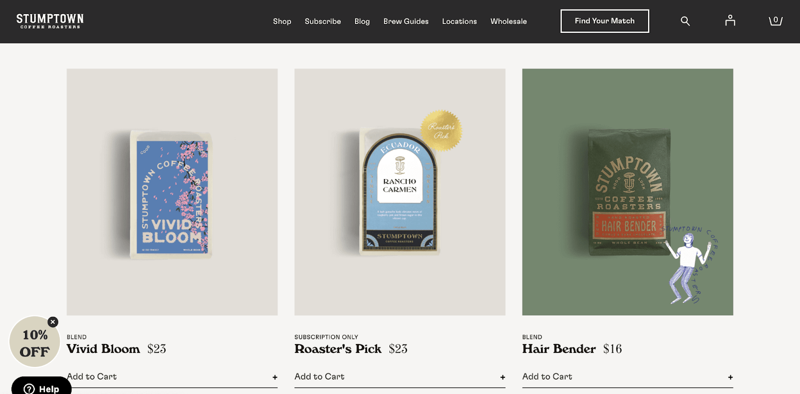
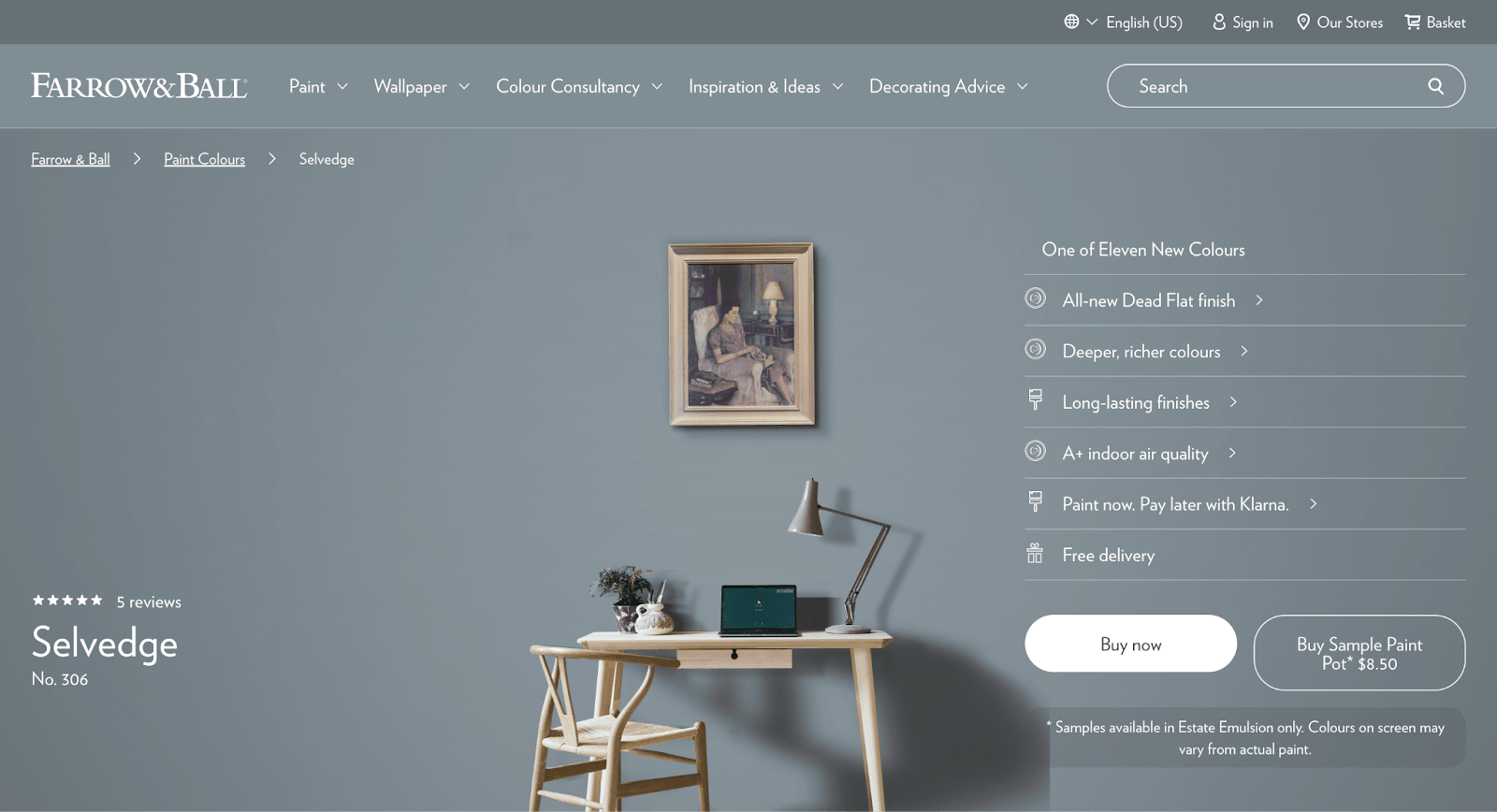
One trend showing up across well-designed product pages is using the product's own color palette as the page background. Applied as a hover effect on a homepage grid or as a full-background treatment on a product detail page, this technique makes otherwise plain product photography feel more immersive and brand-intentional. Stumptown Coffee and Farrow & Ball have both implemented this particularly well — the effect creates continuity between the product and the page that feels custom without being complicated.
Comparison Charts
Comparison charts are increasingly standard on product pages, and for good reason: they help customers make informed decisions quickly by putting features and pricing side by side. The best implementations go beyond just showing your own product variants — they benchmark against competitors or industry standards, which builds credibility while making the case for your product. Quince and Feals both do this well.


Large Type & Images
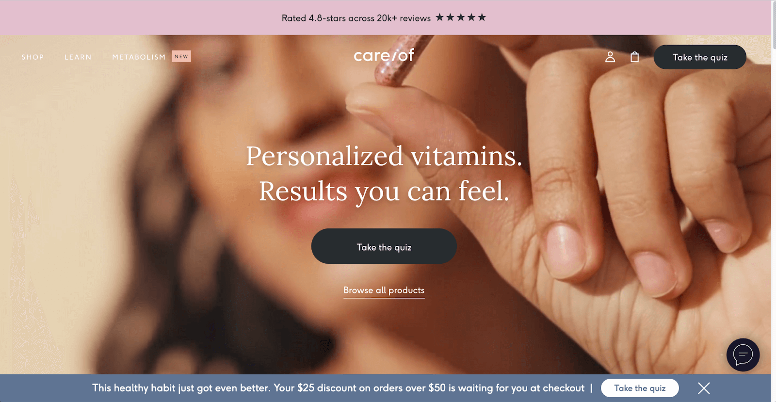
Bigger typography and hero imagery continue to gain ground as a design statement. Used well, large type communicates confidence and gives brands with strong points of view a way to lead with voice rather than just product. Care/Of has been a good example of this approach — bold headlines that communicate the brand's philosophy before the product, which works well for wellness and lifestyle brands where why matters as much as what.
Animated Elements
Animated product reveals, demos, and scroll-triggered animations are becoming a standard tool for conveying product features that static photography can't show. Poppi and Nestig are both strong examples — the animation is purposeful and product-focused rather than decorative. The risk with animation is performance: heavy animations that slow page load times will hurt both UX and SEO. Use animation purposefully and test page speed before and after.
Curves
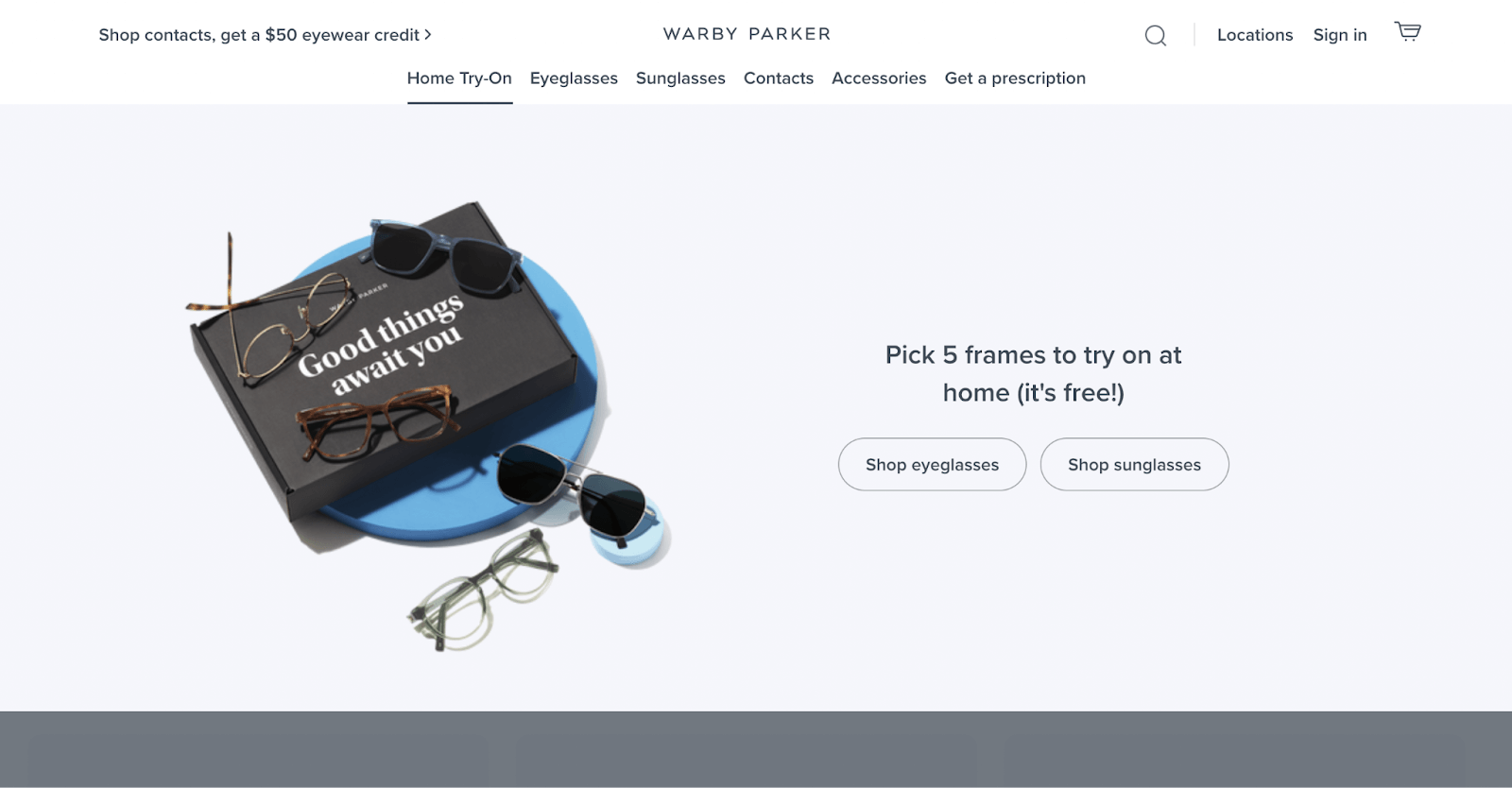
Rounded corners, curved image frames, and pill-shaped buttons have become a defining visual language for brands that want to feel approachable rather than austere. The trend is a reaction against the sharp-edged grid rigidity that dominated design for a few years — curves signal warmth and accessibility. Our client Hyperlite Mountain Gear uses rounded frames effectively without softening the brand's performance positioning. Warby Parker has been doing this well for a while.

Video on Product Pages
Product video has moved from nice-to-have to expected in most categories. Video gives customers a truer sense of texture, scale, and how a product moves or functions in ways that even excellent photography can't fully replicate. Patagonia integrates video naturally into product pages — it's informational rather than promotional, which is exactly the right tone for customers in consideration mode. For Shopify stores, the implementation matters: autoplay muted video on the product page works well; redirecting customers to YouTube does not.
Personalized Experiences
Quizzes, product finders, and personalized recommendations have become a differentiating feature for brands selling in categories with high customer variability — skincare, supplements, haircare, fitness. The personalization creates a guided path to purchase that reduces overwhelm when the product catalog is large or when customers need help matching products to their specific situation. Hers leads with a free assessment on their homepage — the quiz result is a personalized product recommendation, which converts better than asking customers to self-select from a category page.
Cart Drawers
Cart drawers — the slide-in cart panel that appears when a customer adds an item, without navigating them away from the current page — have become nearly standard on well-designed Shopify stores. The UX benefit is clear: the customer can review their cart and continue shopping or go to checkout without losing their place. It also creates a natural moment for upsell and cross-sell placements. Our client Wyman's uses a cart drawer that pulls out from the right side of the screen, keeping the shopping flow intact while making add-on recommendations visible at the right moment.

Design trends are worth paying attention to, but the ones worth implementing are the ones that serve your customers — not just the ones that look current. If you're thinking about a redesign or optimization of your Shopify store, get in touch. We work with brands across outdoor, food, wellness, and specialty retail to build Shopify experiences that convert.


.png)
.png)
