Our Work

Branding for Baske

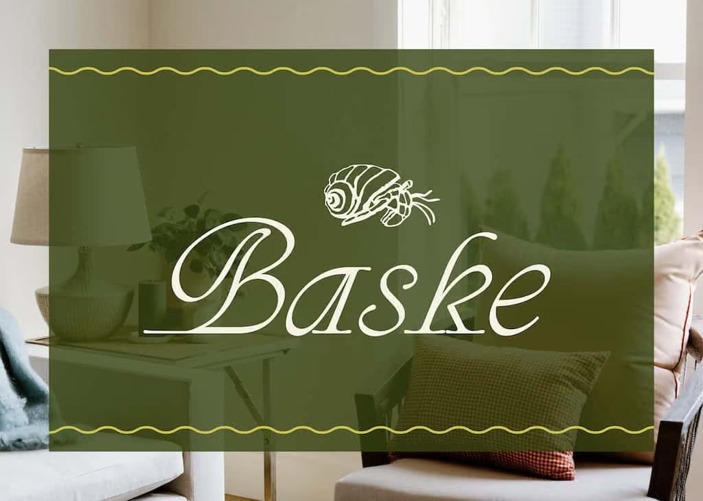
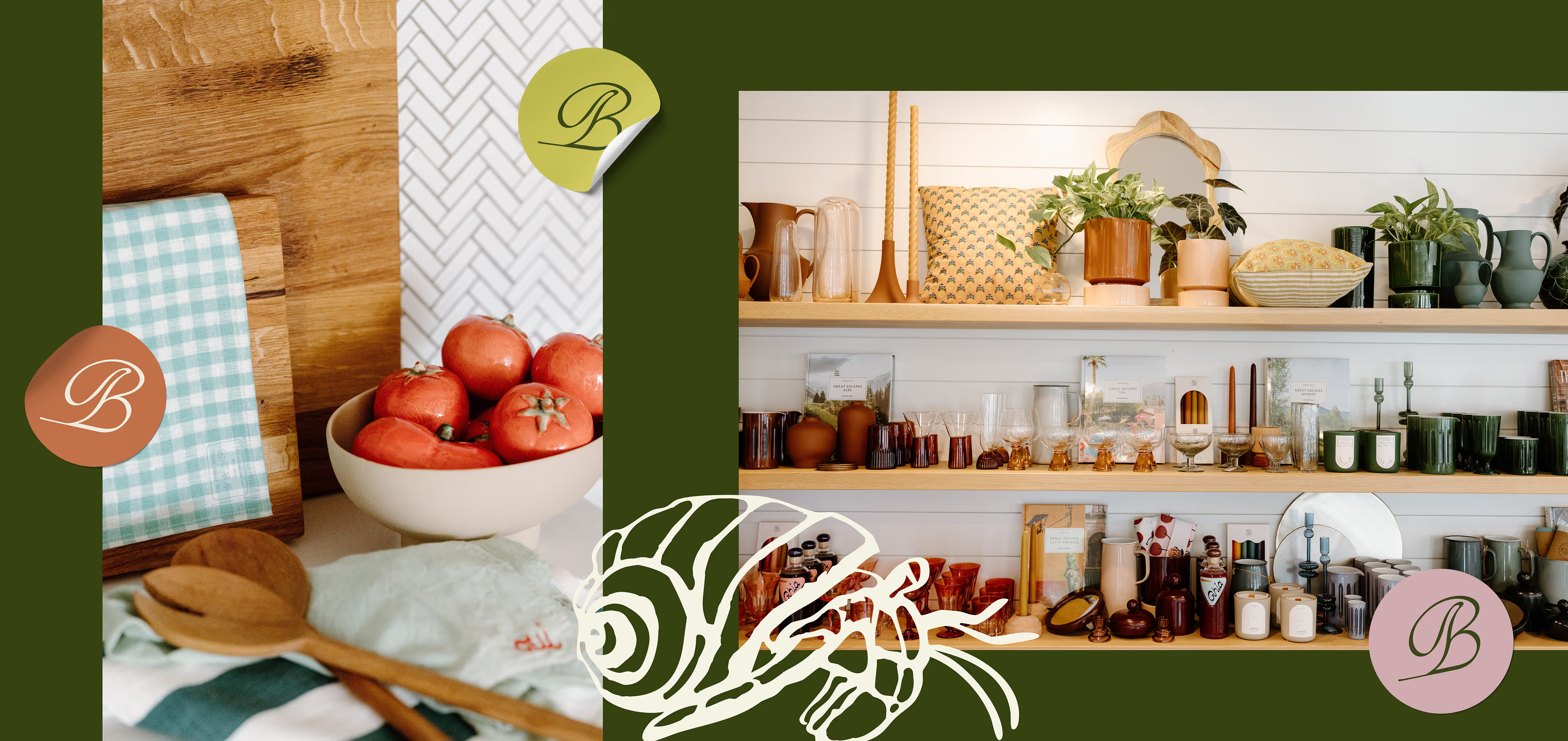
Baske home goods brand identity showing hermit crab logo, wordmark, and coastal color palette

Baske is a home goods store in Portland and Kennebunk, Maine, founded by longtime collaborator Angela Foddrill. When she approached us to develop a brand for the new store, the challenge was clear: translate two decades of retail expertise into a distinct identity that would stand apart from her established Bliss and Little boutiques while speaking to customers who value thoughtful, intentional living.

Background

Angela came to First Pier with a concept for a home goods store and a need to differentiate from two already-beloved brands. The new store required its own distinct personality—one that could stand on its own while still living within the same family of businesses.

The Solution

Through strategic positioning workshops, we identified a core customer persona—aesthetically minded professionals seeking elevated homewares that bridge indoor and outdoor living. This led us to develop Baske, a name derived from the verb "to bask," evoking the warmth and comfort of a well-designed home. The visual identity centers on a hermit crab illustration—a deliberate choice that mirrors how Baske's customers carefully curate their living spaces, much as hermit crabs thoughtfully select and carry their homes. Paired with a flowing wordmark and a coastal-inspired palette of sage greens, warm terracottas, and soft blues, the brand conveys both premium quality and approachable charm.

‍

The Outcome

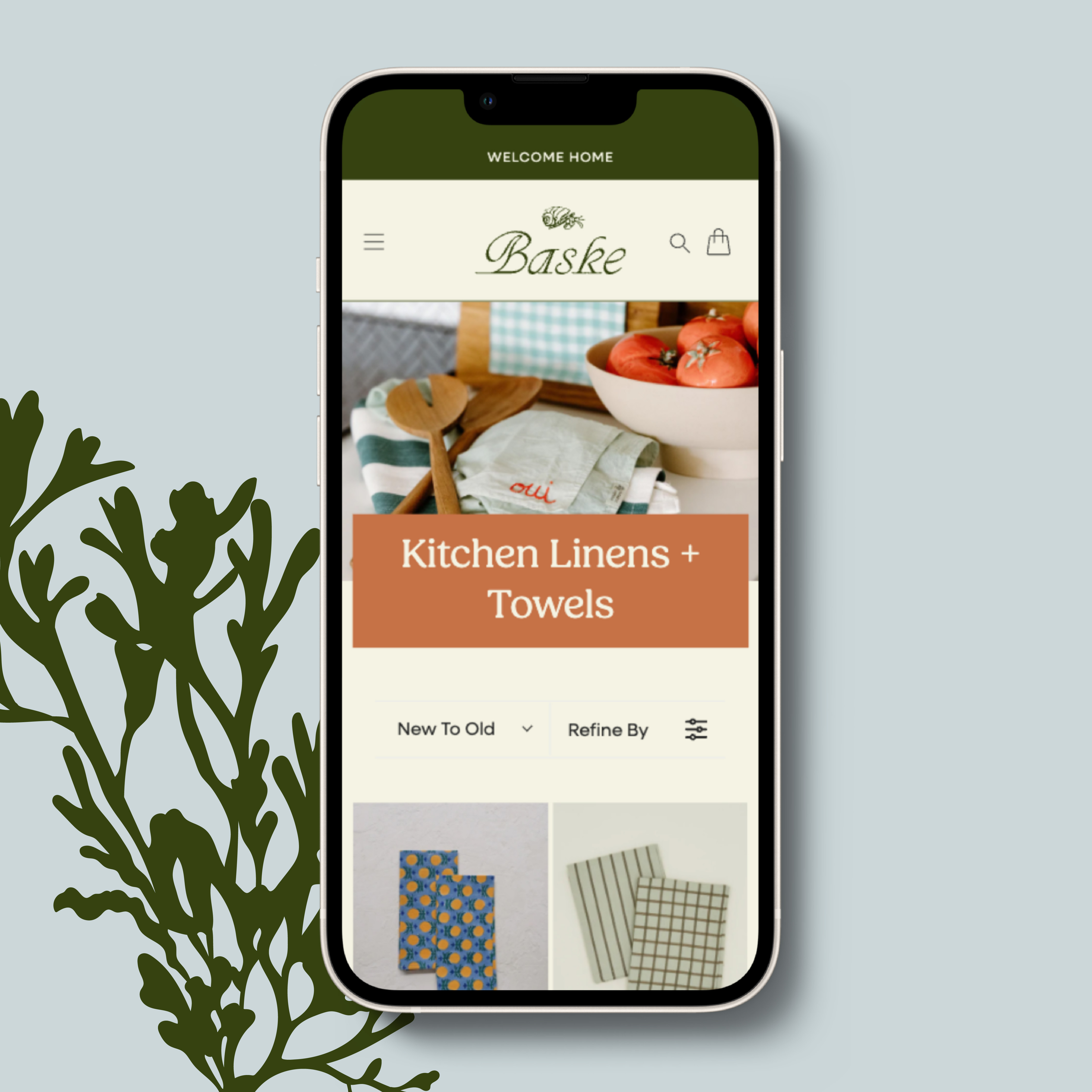
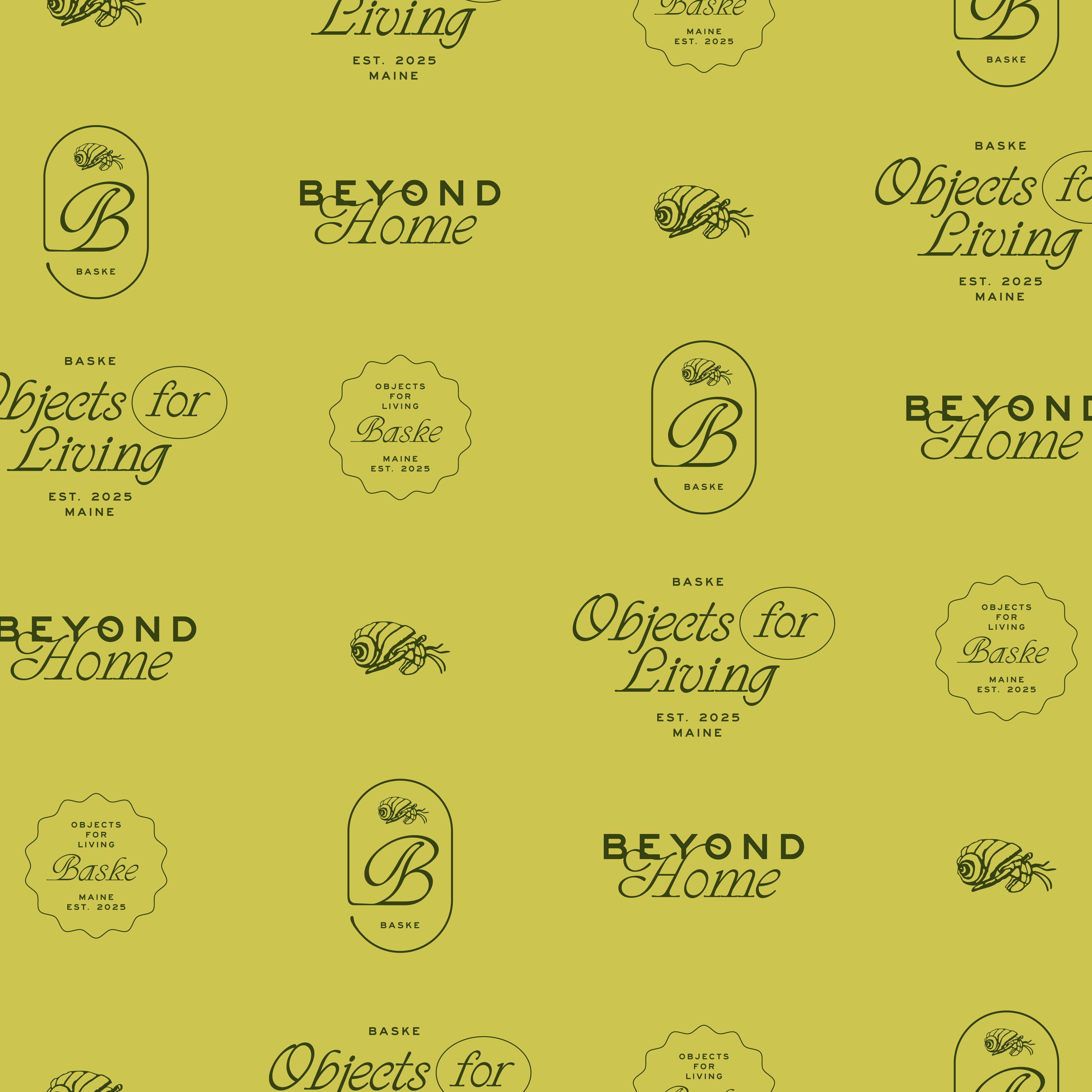
We delivered comprehensive brand guidelines including primary patterns featuring the hermit crab motif, seasonal color palettes, positioning language emphasising 'Objects for Living,' and a complete visual system spanning shopping bags to storefront signage. With both e-commerce and Shopify POS fully integrated across Portland and Kennebunk locations, Baske captured significant seasonal sales immediately after launch and entered the market as a fully operational omnichannel retailer — online and in-store from day one.

A bright blue hand drawn asteriskA bright blue hand drawn bracket

They weren't just building a website—they orchestrated the entire launch of our business. From branding to POS to marketing, they thought through every detail and gave us a scalable foundation.

Angela Foddrill, Owner — Baske

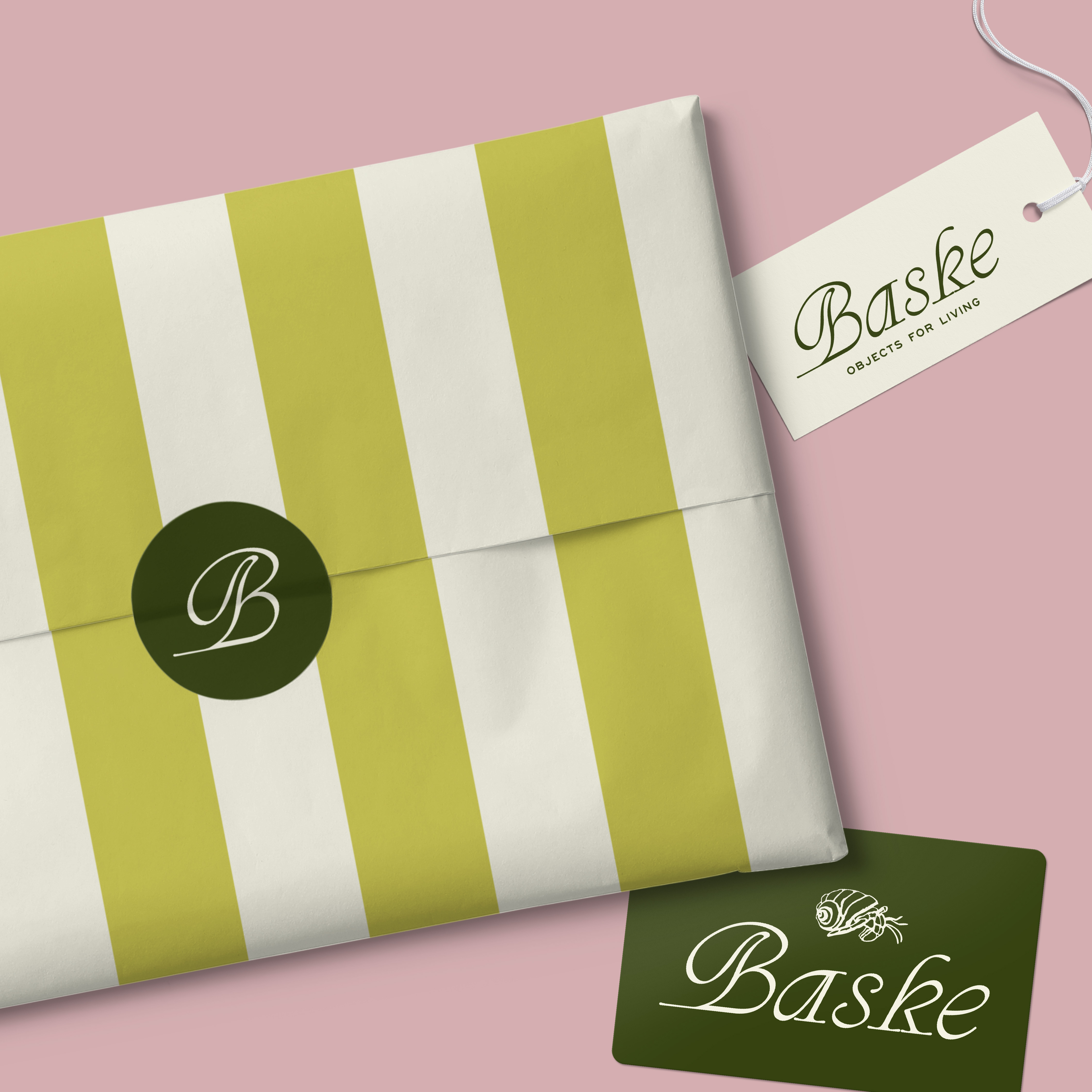
Baske home goods branded packaging featuring the hermit-crab motif and coastal palette
Baske home goods shopping bag and tags in sage green, terracotta, and soft blue

The Takeaway

The difficult part of a third brand is not making it good. It is making it different.

Angela Foddrill already owned two well-loved Portland businesses. Baske had to stand apart from Bliss and from Little clearly enough that a customer would not read it as a line extension — while still plausibly coming from the same person, in the same town, with the same eye.

So the positioning work came before any drawing. The persona it produced — people who furnish a home deliberately and want indoor and outdoor to feel continuous — gave us the name, from "to bask", and the phrase the brand hangs on: Objects for Living.

The hermit crab is the part people remember, and it is not decoration. A hermit crab selects a home, carries it, and changes it when it stops fitting. That is precisely what this customer does, which gives the brand a motif that means something rather than one that merely looks pleasant on a bag.

A logo can be arrived at quickly. Positioning that tells you what the logo should be takes longer, and it is what makes the next ten decisions easy.

A bright blue hand drawn scribbly wave that is part of First Pier's brand colors and patterns