Why Ecommerce Call to Action Buttons Drive Your Revenue Growth
An ecommerce call to action (CTA) is a button, link, or interactive element that tells visitors exactly what to do next - whether that's "Add to Cart," "Buy Now," or "Sign Up." These simple elements serve as the bridge between browsing and buying, guiding customers through each step of their purchase experience.
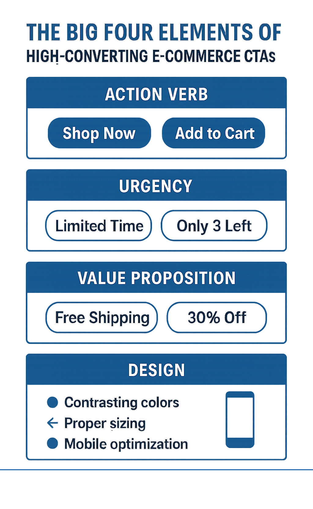
Key elements of effective ecommerce CTAs:
- Action-oriented copy - Use clear verbs like "Shop," "Buy," or "Get"
- Urgency creation - Add time-sensitive language like "Limited Time" or "While Supplies Last"
- Value proposition - Highlight benefits like "Free Shipping" or "30% Off"
- Strategic placement - Position CTAs where customers naturally look for next steps
- Mobile optimization - Ensure buttons work perfectly on all devices
The impact of well-crafted CTAs goes far beyond simple button clicks. Research shows that adding a single, focused CTA to an email campaign boosted clicks by 371% and increased sales by a staggering 1,617%. When customers feel an opportunity is limited, they're more inclined to purchase, which is why tests show urgency can increase conversion rates significantly.
Your CTA strategy is about more than just asking for the sale - it's about helping customers solve their problems at exactly the right moment. As one marketing expert noted, marketers who view selling as helping customers rather than pushing products create more effective CTAs that build trust and drive action.
As Steve Pogson, founder of First Pier and a certified Shopify Expert with over two decades of ecommerce experience, I've seen how strategic ecommerce call to action optimization can turn struggling stores into revenue-generating machines. My team and I have helped leading brands like Wyman's Blueberries and Hyperlite Mountain Gear craft CTAs that guide customers naturally toward purchase while building lasting relationships.
Related content about ecommerce call to action:
Why Your Ecommerce Store Needs Powerful CTAs
Picture this: you've spent countless hours and dollars driving traffic to your store, but visitors keep leaving without buying anything. Sound familiar? The missing piece isn't more traffic - it's powerful ecommerce call to action buttons that guide people from browsing to buying.
Without clear CTAs, your beautifully designed store becomes like a maze without exit signs. Customers get lost, confused, and frustrated. They might love your products, but if you don't tell them exactly what to do next, they'll simply leave and buy from someone who does.
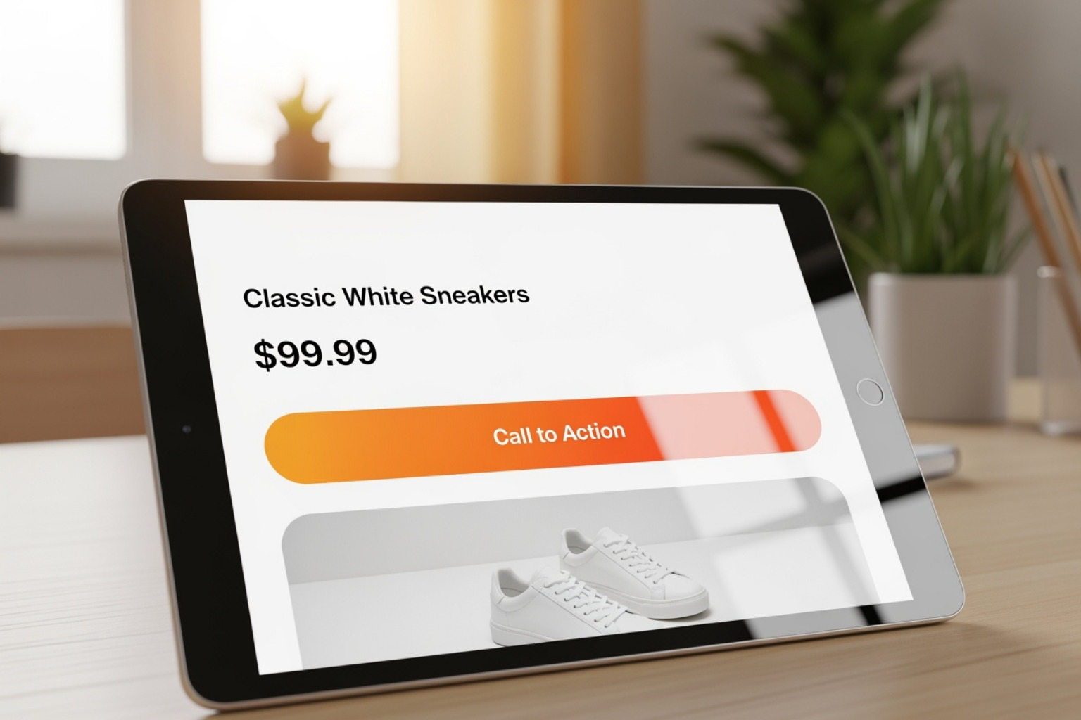
Here's what changed everything for me and my clients: stop thinking of selling as pushy and start thinking of it as helpful. When you truly believe your product solves someone's problem, your CTAs become natural suggestions rather than aggressive demands. This mindset change completely changes how you write every "Add to Cart" and "Buy Now" button.
Your CTAs work as the backbone of your Conversion Rate Optimization (CRO) strategy. They're the critical moments where browsers become buyers, where interest turns into action. Every stage of your sales funnel depends on these decision points to move customers forward.
The numbers don't lie about CTA power. Research shows that a single, focused CTA boosted sales by 1,617% in one study. That's not a typo - one well-crafted call to action increased revenue by over sixteen times. Think about what that kind of improvement could mean for your business.
But here's the thing - most store owners either ignore their CTAs completely or throw too many at customers at once. Both approaches kill conversions. Your customers need clear, confident guidance at exactly the right moments. They want you to make their decision easy, not overwhelming.
When you get your ecommerce call to action strategy right, everything clicks into place. Customers flow naturally through your site, your conversion rates improve, and your revenue grows - all because you learned to help people buy instead of hoping they figure it out themselves.
The Building Blocks of a High-Converting Ecommerce Call to Action
Creating a powerful ecommerce call to action comes down to two essential elements: the words you choose and how you present them visually. Think of it like a conversation with your customer - you want to be clear, helpful, and make it easy for them to take the next step.
Writing CTA Copy That Clicks
The secret to writing CTA copy that actually gets clicks? Put yourself in your customer's shoes. What would make you want to click that button right now?
Start with strong action verbs that tell people exactly what to do. Instead of the generic "Click Here," try something like "Shop New Arrivals" or "Get My Discount." These phrases immediately tell you what happens next and feel more personal.
Speaking of personal, here's something that might surprise you: using first-person pronouns like "my" and "me" instead of "your" and "you" can boost conversions by up to 90%. When someone reads "Get My Free Guide," it creates a sense of ownership that "Get Your Free Guide" just doesn't match. It's a small change that makes a big difference.
Keep your message simple and direct, especially for important actions like adding items to cart or checking out. Your customers shouldn't have to figure out what your button does. "Add to Cart" beats a lengthy explanation every time. If you can't explain your CTA's purpose in a few words, your offer might be too complicated.
Urgency and scarcity work, but only when they're genuine. Phrases like "Limited Stock" or "Sale Ends Tonight" can encourage action, but I always tell my clients to be honest about it. Fake countdown timers and artificial scarcity will hurt your credibility in the long run.
Smart CTAs also address common customer concerns right upfront. If shipping costs are a worry, try "Add to Cart (Free Shipping)." For subscription services, "Start Free Trial - Cancel Anytime" removes a major barrier to signing up.
Every CTA should show clear value to the customer. Don't just tell them what to do - tell them what they'll get. "Join Now" is okay, but "Join Now & Save 10%" is much more compelling. Your button isn't just asking for an action; it's making a promise about what comes next.
The context around your CTA matters just as much as the button itself. Strong headlines and persuasive copy should set the stage, making the CTA feel like the natural next step rather than a random request.
For more strategies on creating compelling product narratives, check out my guide on Content Marketing for Ecommerce.
Designing CTAs for Maximum Impact
Even brilliant copy won't save a poorly designed button. Since visitors form an opinion about your site in just 50 milliseconds, your CTA design needs to grab attention immediately while staying true to your brand.
Color and contrast are your best friends when it comes to CTA design. There's no magic "best" color that works for everyone, but there is a magic principle: make sure your button stands out. A bright orange button on a blue background will outperform a white button on light gray every single time. The key is testing different combinations to see what works best with your specific audience and brand colors.
Size and shape matter too. Your CTA should be large enough to spot easily and click confidently, but not so huge that it overwhelms everything else on the page. Make it clearly look like a button - people expect buttons to have defined edges, maybe a subtle shadow or border. Simple, clean designs with readable text usually win.
Strategic placement can make or break your conversion rates. Put your most important CTAs "above the fold" where people can see them without scrolling. On product pages, position that "Add to Cart" button right where customers expect it - near the price and product details. Don't make people hunt for it.
Give your buttons room to breathe with plenty of whitespace around them. A cluttered design makes everything compete for attention, but clean spacing lets your CTA be the star of the show. This is especially important when you want to guide customers toward one specific action.
Mobile optimization isn't optional anymore. With so many people shopping on their phones, every ecommerce call to action needs to work perfectly on small screens. Buttons should be easy to tap with a thumb, text should be readable without zooming, and the overall experience should feel smooth and natural.
My team here in Portland makes sure every CTA we design passes the "phone test" - if it doesn't work great on mobile, it doesn't ship. The numbers back this up too: mobile popups can actually outperform desktop versions by over 46%.
For more insights on optimizing your entire site for better performance, check out my guide on Ecommerce Website Optimization.
Advanced CTA Strategies for Every Stage of the Funnel
Creating effective CTAs isn't a one-size-fits-all approach. Just like you wouldn't ask someone to marry you on the first date, you can't expect every visitor to make a purchase the moment they land on your site. The key is understanding where your customer is in their buying process and crafting ecommerce call to action buttons that meet them exactly where they are.
Matching Your Ecommerce Call to Action to the Customer Experience
Think of your customer's path to purchase like a relationship that develops over time. Each stage requires a different approach, and your CTAs should reflect that natural process.
At the awareness stage, customers are just getting to know your brand. They're browsing, exploring, maybe reading your blog or checking out your social media. This isn't the time for aggressive sales pitches. Instead, your CTAs should invite them to look around and build trust. Buttons like "Learn More," "Explore Collection," or "Get Your Free Guide" work beautifully here because they're low-pressure and genuinely helpful.
When customers move into the consideration phase, they're interested but still comparing options. They might be reading reviews, checking out your return policy, or looking at product details. This is where CTAs like "Add to Wishlist," "See How It Works," or "Read Reviews" shine. These buttons help users gather information without feeling rushed into a purchase. I particularly love wishlist CTAs because they let you capture email addresses while giving customers a reason to return later.
The decision stage is where the magic happens. Your customer is ready to buy, and your job is to make that process as smooth as possible. This is where direct CTAs like "Buy Now," "Add to Cart," or "Checkout Securely" take center stage. For abandoned cart situations, I've found that gentle reminders like "Finish Checking Out" can be surprisingly effective.
But here's something many store owners miss: the relationship doesn't end after the sale. Post-purchase CTAs are crucial for building loyalty and encouraging repeat business. Buttons like "Leave a Review," "Join Our Rewards Program," or "Reorder Now" keep customers involved with your brand long after their first purchase.
The power of personalization can't be overstated here. Research shows that personalized CTAs perform 202% better than generic CTAs. When you show a returning customer who viewed a specific product a "Shop Now" button versus showing a new visitor a "Learn More" button, you're speaking their language at exactly the right moment.
For deeper insights into guiding customers through their complete buying process, check out my guide on Ecommerce Sales Funnel Optimization.
Different Types of CTAs and Where to Use Them
Beyond understanding the customer's mindset, it's important to match your ecommerce call to action strategy to where and how you're communicating with customers.
Lead generation CTAs are your relationship builders. These buttons aim to capture contact information in exchange for something valuable. Think "Sign Up for Our Newsletter," "Get Your Free Ebook," or "Subscribe for 10% Off." I love using these in pop-ups, especially exit-intent ones, because they catch visitors just as they're about to leave. Website footers and blog sidebars are also perfect spots for these gentle conversion opportunities.
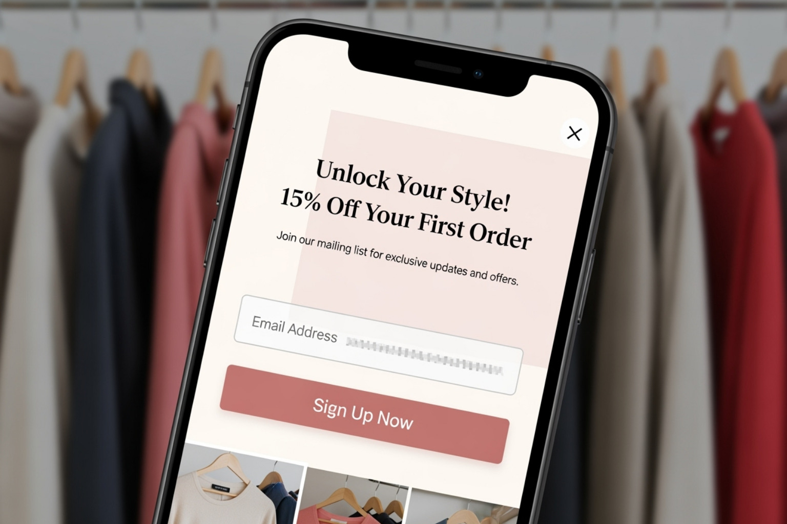
This Fashion Nova lead generation pop-up is a perfect example of offering immediate value to capture an email address.
Click-through CTAs are your content workhorses. These encourage users to look deeper into your site or learn more about your products. Buttons like "See How It Works," "View Gallery," or "Read Full Article" are perfect for blog posts, informational pages, and social media posts. They get people involved and help show your expertise.
Sales CTAs are the direct path to revenue. These are your "Shop Now," "Buy Now," and "Add to Cart" buttons that appear on product pages, category pages, and in promotional emails. These are the most important ecommerce call to action elements for direct revenue generation.
Social engagement CTAs help build your community and increase your reach. "Follow Us on Instagram," "Share on Facebook," or "Join Our Group" buttons work great on blog posts, thank you pages, and in email footers. They turn customers into brand supporters.
When it comes to placement, context is everything. Website CTAs need a clear visual order of importance - if you have multiple buttons on one page, one primary action should always stand out. I've seen too many stores overwhelm visitors with competing CTAs, leading to decision paralysis where customers end up doing nothing at all.
Email CTAs work best when they're focused. I strongly recommend using a single, clear call to action in each email campaign. This keeps your message sharp and makes tracking results much easier. Social media CTAs need to be brief and mobile-friendly since most social browsing happens on phones where attention spans are short.
The key is matching your CTA type to your communication channel and your customer's mindset. When you get this match right, your conversion rates will thank you.
For more strategies on combining these elements into a complete marketing approach, check out my insights on Shopify Marketing Strategy.
Testing and Optimizing Your CTAs for Better Results
Creating an ecommerce call to action isn't a "set it and forget it" task. The most effective CTAs come from continuous testing and improvement, much like how a chef perfects a recipe through countless taste tests.
The Power of A/B Testing Your CTAs
A/B testing changes CTA optimization from guesswork into science. It involves creating two (or more) versions of a CTA and showing them to different segments of your audience to see which performs better. Even small tweaks can lead to big improvements in conversion rates.
Here's why I'm passionate about A/B testing for ecommerce call to action optimization:
Data-driven decisions take the guesswork out of the equation. Instead of relying on what you think customers want, you're making choices based on how they actually behave. Continuous improvement means even a 1% boost in CTA performance compounds over time, creating big revenue gains. Most importantly, understanding your audience becomes clearer - testing reveals what language, colors, and offers truly connect with your specific customer base.
When it comes to what you should test, the possibilities are nearly endless. Copy testing might involve comparing different action verbs like "Shop Now" versus "Get Yours," or experimenting with pronoun usage - remember, research shows that using "my" instead of "your" can boost conversions significantly. You might test urgency phrases like "Limited Time" against "Shop Today," or compare benefit-driven copy such as "Get Free Shipping" versus a simple "Proceed to Checkout."
Design testing opens up another world of possibilities. Button color comparisons (green versus orange, for instance), different sizes and shapes, placement experiments (above the fold versus below), and even the amount of whitespace around your button can all impact performance. Offer testing lets you compare different discount percentages, free gifts versus percentage discounts, or various free shipping thresholds.
One fascinating finding is that personalized CTAs perform 202% better than generic ones. This means testing different personalization strategies - showing returning customers different CTAs than first-time visitors, for example - can dramatically improve your results.
For expert help in fine-tuning your conversion efforts, consider checking out our services for Improving Conversion Rates.
Common CTA Mistakes to Avoid
While creating great CTAs involves creativity and strategy, there are predictable pitfalls that can sabotage your efforts. Avoiding these mistakes can save you a lot of lost conversions and frustration.
Generic copy tops my list of CTA sins. Please avoid "Submit" at all costs - it's vague, uninspiring, and wastes valuable real estate on your page. "Click Here" is equally problematic because it tells users nothing about what they're clicking for. Always be specific and highlight the benefit.
Weak design or blending in makes even brilliant copy useless. If your ecommerce call to action doesn't stand out visually, it might as well be invisible. I've seen countless CTAs that match their background color, appear too small to notice, or don't even look clickable. Your CTA should practically jump off the page.
Missing urgency opportunities can cost you sales, though I always caution against manufactured scarcity. If you genuinely have a limited-time sale or low stock, make that clear in your CTA. Authentic urgency encourages action; fake urgency hurts trust.
Mobile unfriendliness is a conversion killer. If your CTA buttons are too small to tap easily, positioned too close together, or break entirely on mobile devices, you're losing a massive part of potential sales. Always test your CTAs across various mobile devices and screen sizes.
Mismatched intent brings us back to that "marriage on the first date" concept. Bombarding new visitors with aggressive "Buy Now" buttons when they're still browsing for information creates friction. Your CTA should match perfectly with where customers are in their experience.
Too many choices create what psychologists call decision paralysis. When a page displays multiple, equally prominent CTAs competing for attention, customers often choose none. Make it clear which action is most important and focus on one primary ecommerce call to action per page whenever possible.
Robotic language makes your brand feel distant and impersonal. CTAs should sound natural and conversational, avoiding overly formal or jargon-heavy phrasing. Using personal pronouns like "my" and "me" helps create that sense of ownership and connection.
Platform blindness means forgetting that different platforms require different approaches. A CTA that works beautifully on your website might fall flat on Instagram or in an email campaign. Each platform has its own conventions and user behaviors that should guide your CTA strategy.
Skipping the testing phase is the biggest mistake of all. Assuming your CTAs are perfect without confirmation through testing leaves money on the table. The most successful ecommerce brands I work with treat CTA optimization as an ongoing process, not a one-time task.
To help you sidestep these common pitfalls, I've created a complete CRO Checklist for Shopify that walks you through the essential optimization steps. Great CTAs aren't born - they're improved through careful testing, thoughtful design, and a deep understanding of your customers' needs.
To sum up
Creating powerful ecommerce call to action elements isn't just about picking the right words or colors – it's about truly understanding your customers and helping them solve their problems at exactly the right moment. When you approach CTAs with a mindset of service rather than selling, everything changes.
The most important thing to remember is that your ecommerce call to action should always guide customers naturally toward their next step. Whether that's learning more about your products, adding items to their cart, or joining your email list, clarity is king. Tell people exactly what to do, make it easy for them to do it, and always explain what's in it for them.
Design matters just as much as your words. Your CTAs need to stand out visually while feeling like a natural part of your brand experience. They should work perfectly on mobile devices, use colors that create strong contrast, and have enough white space to breathe. You have just 50 milliseconds to make that first impression count.
The real magic happens when you match your CTAs to where customers are in their experience. A first-time visitor needs different guidance than someone who's already added items to their cart. Personalization makes all the difference here – those custom CTAs really do perform 202% better than generic ones.
Most importantly, never stop testing. What works for other stores might not work for yours, and what worked last month might not work today. A/B test your copy, colors, placement, and offers regularly. Even small improvements add up to big revenue gains over time.
At First Pier, my team and I help brands build high-performance online stores by optimizing every detail, including the calls to action that drive growth. We believe that continuous improvement and focusing on the customer experience are what separate successful stores from the rest. If you're ready to improve your customer experience and boost your conversions, get expert help with your ecommerce UX design.





.png)
.png)
