


Good Shopify design isn’t about looking impressive — it’s about making it easy for a customer to find what they want and buy it with confidence. Most design problems that hurt conversion come down to a few recurring issues. Here’s how to address them.
Start With the Right Theme
Your theme sets the foundation for every design decision that follows. Shopify’s free themes — particularly Dawn — are well-built, fast, and increasingly capable. For most stores, the right question isn’t “which theme looks best” but “which theme is fast, flexible, and fits how my catalog is structured.”
Things to evaluate when choosing a theme: page load speed, how product pages handle multiple images and variants, whether collection filtering is built in, and how the mobile layout behaves. Don’t choose a theme based on the demo store — preview it with your own products and content.
Navigation Should Be Obvious
Customers who can’t find what they’re looking for leave. Your navigation should reflect how customers think about your products, not how you’ve organized your backend. Limit top-level nav items to five or six. Use dropdown menus for categories, not a flat list of every collection.
Include a search bar. It’s one of the highest-intent interactions on a store — someone using search knows what they want. Make sure your search results are accurate and that zero-result pages handle gracefully.
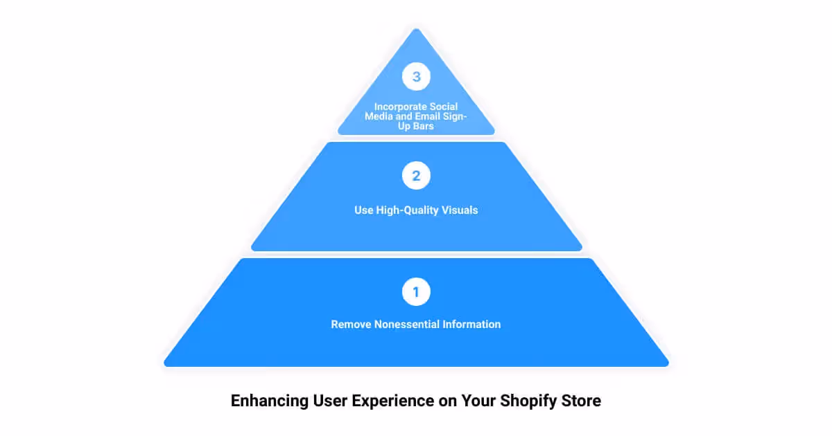
Homepage: Direct, Not Decorative
The homepage has one job: direct visitors to the next step. That might be a featured collection, a bestseller, a seasonal promotion, or a brand story that builds enough trust to push someone into the catalog. It should not be a cluttered showcase of everything you sell.
Lead with a clear headline and a call to action above the fold. Keep the number of homepage sections to a minimum — five or six is usually enough. Every section should earn its place by serving a clear purpose for the customer.
Product Pages Do the Heavy Lifting
Most of the conversion work happens on product pages. A few things that have an outsize impact:
Images: Use multiple angles, show scale, include lifestyle shots where relevant. Shopify’s image zoom and video support are worth using for higher-priced items where customers want to inspect before buying.
Product descriptions: Write for the customer who isn’t sure yet. Answer the questions they’d ask in person — materials, dimensions, compatibility, care instructions. Skip the superlatives.
Social proof: Reviews placed near the buy button convert better than reviews buried at the bottom of the page. Use a reviews app that displays ratings prominently.
Variant selectors: If you sell apparel or anything with size/color variants, use swatches rather than dropdowns where possible. Make out-of-stock variants visually distinct.
Mobile Is Not a Secondary Experience
Well over half of ecommerce traffic comes from mobile. Design decisions should be evaluated on mobile first. Common mobile problems: buttons that are too small to tap accurately, images that load slowly, checkout flows that require too much typing, and nav menus that are hard to use with a thumb.
Test your store on a real phone regularly — not just a browser DevTools simulator.
Checkout Should Have No Friction
Shopify’s checkout is deliberately limited in terms of what you can customize outside of Shopify Plus. Within those limits, the most impactful changes are: enable accelerated payment options (Shop Pay, Apple Pay, Google Pay), add a trust badge or security statement near the payment fields, and make sure your shipping and return policy is accessible from the checkout page.
On Plus, you can customize the checkout further through checkout extensibility — worth exploring if your conversion data suggests checkout drop-off is a significant problem.
Speed Is a Design Decision
Slow stores lose customers. Every element you add to a page — images, apps, scripts, carousels — has a cost. Measure your Core Web Vitals regularly using Shopify’s built-in performance dashboard and PageSpeed Insights. When you install a new app, check what it adds to page weight.
The stores that convert well aren’t always the most visually impressive — they’re the ones that are fast, clear, and easy to navigate on any device.


.png)
.png)

