Our Work

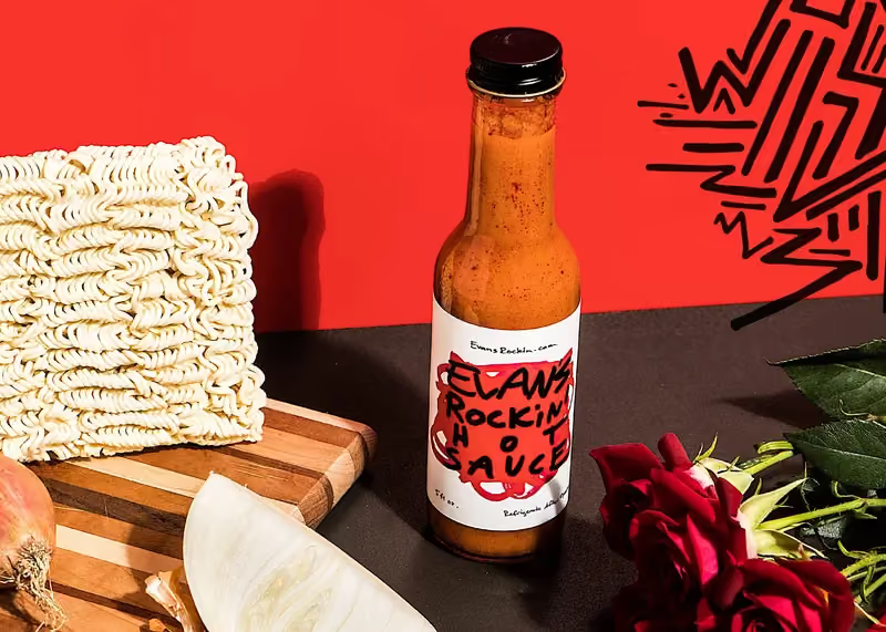
Branding for Evan's Rockin' Hot Sauce

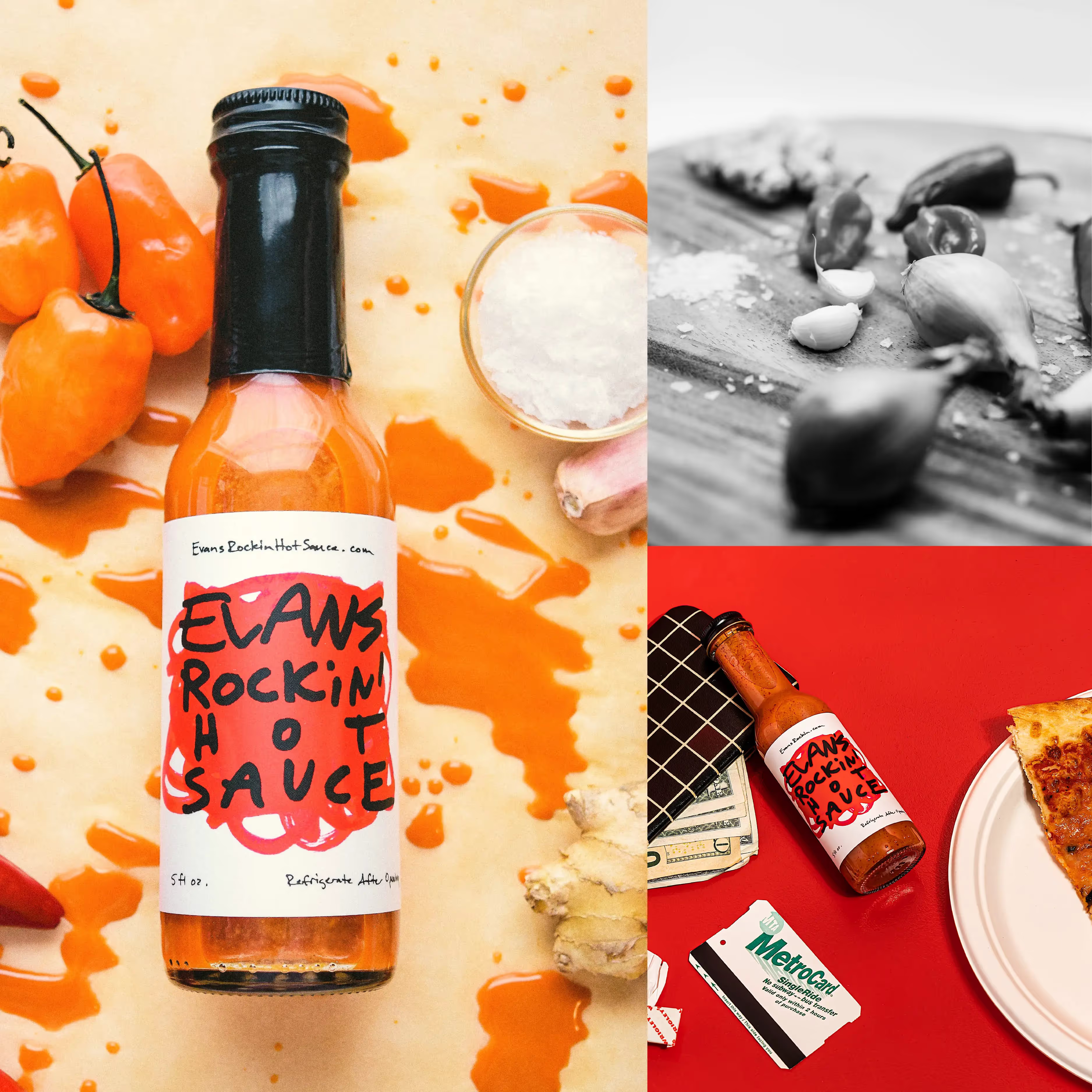
A bottle of beer next to a cutting board with a knife

Evan’s Rockin’ Hot Sauce is an approachable, fun-loving hot sauce built with a DIY-spirit and an understated obsession with quality.

Background

Bleachers saxophonist Evan Smith is a touring musician with a background in kitchens who came to us to help take his indie hot sauce side project to the next level. He’d been making sauce and selling it at the band’s merch table, hand-labeling on the road using stick-on labels and a Sharpie. He came to us wanting a brand that stayed true to those roots but elevated to its own well-deserved rock-and-roll status.

A bottle of hot sauce next to a plate of pizza

The Solution

We took inspiration from Evan’s handwritten labels and his love for the ✨  emoji and built a brand that feels fresh and vibrant and, most importantly, true to its backstage beginnings. Deepened with pattern and ingredient-focused iconography, the brand we designed keeps the promise on the label: “no weird stuff.”

The Outcome

We were able to spice up Evan’s home-grown sauce brand and create an online platform that brings the heat.

Claws Rockin' Hot Sauce bottles and brand scenes with people
Banana, hot sauce bottle, and red peppers on a colorful background
Caramel-drenched dessert with dramatic wow speech bubble
A bright blue hand drawn asteriskA bright blue hand drawn bracket

First Pier finds important parts of my brand's identity and translates them perfectly into visual language. Thorough and creative, they take pieces that I've made and show me them in a different way without generating a whole new identity.

Evan Smith, President — Evan's Rockin' Hot Sauce

Elaws Rockin' Hot Sauce brand identity design with logo and style guide

The Takeaway

The hardest brief in branding is “don't reinvent me.”

Evan Smith was hand-labelling bottles with stickers and a Sharpie and selling them off a merch table between sets. That was not a placeholder for a real brand — it was the brand, and an identity that erased it would have thrown away the one thing the sauce had that no supermarket competitor could buy.

So the work was archaeology before it was design. The handwritten labels, the ✨, the promise of “no weird stuff” — all of it already existed, and none of it was being used deliberately. What we added was pattern, ingredient-focused iconography and a system that let those pieces carry onto a shelf and a rebuilt Shopify store without losing the backstage. Revenue rose between 85% and 100% afterwards.

A founder is usually too close to see which of their improvisations are assets. Naming them is most of the job.

A bright blue hand drawn scribbly wave that is part of First Pier's brand colors and patterns